Feature Adoption Rate: The Denominator Problem
Feature adoption rate is quoted as one number and published four different ways. A denominator decision table, a worked example, and the measurement window to use.
Feature adoption rate fails in a specific, repeatable way, and the failure has nothing to do with the number being low. The rate gets computed once, lands on a slide, and then nobody can reconstruct what was in the bottom of the fraction. Six weeks later somebody rebuilds it from a different table, gets 31% where the slide said 12%, and both numbers survive the argument because neither was ever defined.
The numerator is the easy half: count the distinct users or accounts that performed a qualifying action. The denominator is a choice, and the choice moves the answer by more than an order of magnitude. Below I take one month of internally consistent usage figures and compute six different rates from them without touching the numerator once. The lowest is 3.0% and the highest is 45.0%.
What Is Feature Adoption Rate?
Feature adoption rate is the share of an eligible population that performed a qualifying action in a specific feature inside a stated time window. Three components, and the four published rules below differ on all three.
| Component | What it decides | How often it is published |
|---|---|---|
| Numerator rule | Which event counts as “adopted”, and how many times it has to fire | Usually stated loosely as “used the feature” |
| Denominator | Which population was eligible to adopt in the first place | Stated, but differently by every source below |
| Window | The period the count covers, and whether it rolls or resets | Frequently omitted altogether |
Leave any of the three unstated and nobody can rebuild the number, including whoever inherits the dashboard.
Feature Adoption Rate Formula: Four Published Versions
The four pages below all answer the question “what is the feature adoption rate formula”. Three different populations turn up in the denominator across them, and one page offers two of those populations in the same sentence without choosing between them.
| Source | Published rule | Denominator named | Window named |
|---|---|---|---|
| Pendo’s feature adoption guide | ”Monthly Feature Adoption Rate (%) = [feature MAU / monthly logins] * 100” | Monthly logins | Monthly |
| Userpilot on feature adoption metrics | ”divide the number of users who adopted the feature by the total number of active users in the same period, then multiply by 100” | Total active users | ”the same period”, unspecified |
| Whatfix on feature adoption | ”divide the monthly active users who tried out the feature in question by the total number of logins or active users during the same duration” | Logins or active users | Monthly |
| Appcues on feature adoption metrics | ”Imagine 6,000 of your 10,000 customers use your app’s new template editor at least four times within a week. 60% of customers would be considered to have adopted” | Total customers, unit unstated | One week, plus a four-use threshold |
Read those four rows next to each other and the disagreement is not a rounding difference. Pendo divides by logins, so a user who signs in twenty times in a month is counted twenty times in the denominator and once in the numerator. Userpilot divides by unique active users. Whatfix offers both denominators in a single sentence without saying which to pick. Appcues divides by customers, a word its page swaps for “users” in the same paragraph while describing the same population, and requires four uses in a week before the word “adopted” applies at all.
None of those formulas is wrong. They answer different questions, and on the same raw data they return different numbers. The worked example below shows how far apart.
The Denominator Decision Table
This is the table I wanted when I started reading around this metric. Each row is a defensible denominator with a job it does well and a way it misleads.
| Denominator | Who it counts | Use it for | What it flatters or punishes | Where it breaks |
|---|---|---|---|---|
| All customer accounts | Every paying account, active or not | Renewal and customer success coverage: how much of the book has touched this | Punishes any feature gated behind a plan tier | Dormant accounts sit in the denominator forever and drag the rate down permanently |
| All provisioned seats | Every user record ever created | License utilization arguments | Punishes products with many inactive seats per account | Deprovisioning lag makes the trend meaningless |
| All active users in the window | Anyone who signed in during the period | A single company-wide comparison across features | Neutral, which is why it is the default | Moves when the active base moves, so the rate changes with no behavior change |
| Entitled users only | Users on plans, roles, regions or flags where the feature is switched on | Judging whether the feature works for the people who have it | Removes the entitlement penalty, so it flatters relative to the rows above | Requires an entitlement table that is actually accurate |
| Users who reached the surface | Users who rendered the screen or saw the entry point at least once | Separating a discovery failure from a value failure | Flatters hardest, because everyone in it already found the feature | Useless on its own; the discovery drop-off has to be reported beside it |
| Users with the job to be done | Users whose role, segment or workflow implies they need it | Product and PMM decisions about whether to keep investing | The most honest and the hardest to defend, since the definition is yours | Somebody has to write down the role or behavior rule, and defend it |
Rules I apply to that table:
- Start at the narrowest population you can define from data you already collect. A rate against a population you had to guess at is worse than a rate against a population you can query.
- If the denominator is more than three times the size of the entitled active population, relabel the number. At that ratio most of the denominator is made of people who could not switch the feature on or never signed in, so the rate describes packaging and activity rather than the feature.
- Never publish the rate without the denominator count beside it. “12% (of 2,250 entitled active users)” survives a rebuild six weeks later. “12%” does not.
The same discipline applies to every metric a PMM puts on a slide, which is why adoption belongs with the outcome metrics rather than the activity metrics in my breakdown of product marketing metrics.
How to Calculate Feature Adoption Rate: A Worked Example
The figures below are illustrative, computed for this example, and internally consistent so the arithmetic can be checked. The product is a B2B SaaS reporting tool. The feature is scheduled reports, shipped at the start of a 30-day window.
Two ladders run in parallel, one counting accounts and one counting users, and mixing the two is how a denominator goes wrong before the arithmetic even starts. The account ladder:
| Account population | Count | Definition used |
|---|---|---|
| Customer accounts | 1,200 | Every paying account |
| Accounts entitled to the feature | 540 | Growth and Enterprise plans only |
| Accounts with at least one scheduling user | 165 | The account-level numerator |
The user ladder, which nests from top to bottom apart from one fork:
| User population | Count | Definition used |
|---|---|---|
| Provisioned seats, all accounts | 9,000 | Every user record |
| Seats on entitled accounts | 4,500 | Every user record on a Growth or Enterprise account |
| Monthly active users, all accounts | 3,600 | Signed in at least once in the window |
| Monthly active users, entitled accounts | 2,250 | Signed in at least once, on an entitled account |
| Users whose role owns recurring reporting | 900 | Admin or analyst flag, entitled and active in the window |
| Users who opened the Reports screen | 600 | Screen-view event fired at least once |
| Users who scheduled at least one report | 270 | The numerator |
| Users who scheduled reports in two separate weeks | 135 | The retained numerator |
The fork sits between the 4,500 entitled seats and the 3,600 monthly active users across all accounts. Both are inside the 9,000 provisioned seats and neither contains the other, because the active count includes users on the 660 accounts with no entitlement and the seat count includes entitled users who never signed in. Their intersection is the 2,250 monthly active users on entitled accounts, and every row below that one nests cleanly, down through the 270 adopters to the 135 who came back.
Hold the numerator at 270 and change nothing else:
| Denominator | Count | Arithmetic | Feature adoption rate |
|---|---|---|---|
| All provisioned seats | 9,000 | 270 / 9,000 | 3.0% |
| Seats on entitled accounts | 4,500 | 270 / 4,500 | 6.0% |
| Monthly active users, all plans | 3,600 | 270 / 3,600 | 7.5% |
| Monthly active users, entitled accounts | 2,250 | 270 / 2,250 | 12.0% |
| Users whose role owns recurring reporting | 900 | 270 / 900 | 30.0% |
| Users who opened the Reports screen | 600 | 270 / 600 | 45.0% |
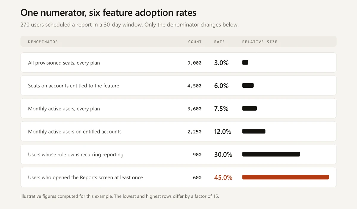
The spread between the smallest and largest user-level rate is a factor of fifteen, since 45.0 divided by 3.0 is 15. Every one of those six percentages is arithmetically correct.
The account-level view adds two more answers from the same month: 165 of 1,200 accounts is 13.75%, and 165 of the 540 entitled accounts is 30.6%. A customer success leader planning renewal conversations wants the second number. A board deck reaching for a single headline usually grabs the first without saying so.
One honesty note about the nesting. In this illustration the 600 users who opened the Reports screen sit inside the 900 whose role owns reporting. Real instrumentation does not hand you that: some users reach the surface without holding the role, and some role-holders never reach the surface. You have to decide whether to intersect the two sets or report them separately, and the count of role-holders who never reached the surface is its own finding. Stage-level instrumentation of that kind is the same discipline described in my guide to customer journey analytics.
Adopted Once vs Retained: Choosing the Window
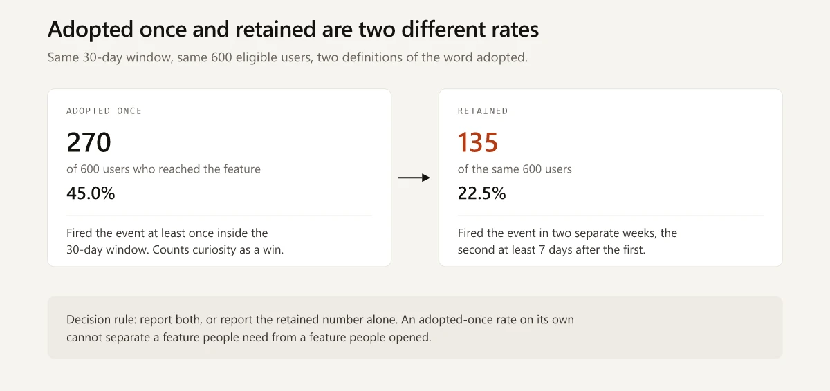
An adoption rate with no repeat-use requirement cannot separate a feature people need from a feature people opened. Userpilot’s own framing ends its four-stage journey on “Used again: The user keeps returning over time, signaling that habit has genuinely formed”. Pendo names the same idea as duration of adoption: “How long do users continue to use a feature after learning about it? Do they just try it out a few times or continue to use it over the course of months and years?”
Neither framing gives you a number to code against, so these are the definitions I would put into a query. They are mine rather than a standard, and their value is that they are written down.
| Label | Definition | What it is for |
|---|---|---|
| Adopted once | At least one qualifying event inside a rolling 30-day window | Launch reporting in the first month |
| Retained | Qualifying events in at least two distinct calendar weeks of the window, with at least 7 days between the first and a later one | Deciding whether the feature earned a place in the workflow |
| Habitual | Qualifying events in at least four of the last eight weeks | Deciding whether to keep investing in it |
Applied to the worked example, on the 600-user denominator: 270 users adopted once, which is 45.0%, and 135 of them came back in a later week, which is 22.5%. Exactly half the adopters were curious rather than committed.
Pick a window and state whether it rolls or resets. Microsoft publishes its choice for the Microsoft 365 Adoption Score: the score “is updated daily and reflects user actions completed in the last 28 days (including the current day)”. A rolling 28 or 30 days smooths weekly cycles; a calendar month is easier to reconcile with billing and easier to argue about at the end of a short month.
Feature Adoption Funnel and the Denominator at Each Stage
A single rate cannot say whether users failed to find the feature, failed to complete a first use, or failed to come back. A feature adoption funnel pulls those apart, and each stage carries its own denominator.
Userpilot describes the four stages as “Exposed: The user has encountered the feature, through an in-app announcement, a tooltip, or organic discovery during normal product use”, “Activated: The user has taken their first meaningful action within the feature”, “Used: The user is engaging with the feature on a regular basis”, and “Used again: The user keeps returning over time”.
| Stage | The question it answers | Denominator that fits | What a low number points at |
|---|---|---|---|
| Exposed | Does the feature exist for these users at all? | Entitled active users | Placement, announcement, entry point |
| Activated | Did they complete a first meaningful use? | Users who reached the surface | Setup friction, permissions, empty states |
| Used | Is it in the workflow? | Users with the job to be done | Value fit, or the wrong audience |
| Used again | Did the habit form? | Users who already adopted once | Value that does not compound, or a one-time job |
Pendo’s guide cuts the same territory into four measurement dimensions rather than stages: breadth of adoption, depth of adoption, time to adopt, and duration of adoption. Running both is redundant. Pick the one your analytics tool already supports and keep it.
The stage where a launch leaks tells you who owns the fix. A leak at Exposed is a distribution problem, which is why the release note is a marketing deliverable rather than a docs chore, as I argued in the SaaS release notes breakdown. A leak at Used is a positioning or audience problem, and it belongs upstream with the people who decided the feature was worth building.
Core Feature Adoption Rate and Published Benchmarks
Core feature adoption rate applies the same calculation to the handful of features the product cannot be used without, rather than to whatever shipped last sprint. Userpilot defines it on its benchmark page as “the percentage of users who habitually use the product’s key features”.
That same page is where Userpilot publishes its feature adoption rate benchmark. It reports first-party data from 547 SaaS companies and says sales-led companies in the sample had “higher core feature activation rates (26.7% vs 24.3%)” than product-led ones, and that “HR companies boasted the highest core feature adoption rate at 31%”. A second Userpilot page summarizes the same report as “the average core feature adoption rate for SaaS products at 24.5%”. The report page lists the metric as “Core Feature Adoption Rate” among its six and then calls it “core feature activation rates” in the comparison sentence, which is a fair preview of how loosely the vocabulary travels.
Now check what you would need in order to use that as a benchmark. Searching the benchmark page for a formula, a denominator, the phrase “active users”, or any measurement window attached to core feature adoption rate returns nothing. The page does publish a window for the retention metric it reports alongside (“1-month retention”) and none for adoption, and it gives no threshold for the word “habitually”.
So the number is real, first-party, and drawn from a 2024 sample. It is also unusable as a comparison, because you cannot tell whether your 12% and their 24.3% were computed against the same population. Nothing about that is Userpilot’s failing. The dashboard product that sells against these numbers has no reason to publish a denominator that would let a customer compute a lower figure.
Two comparisons are still available and both are free:
- Compare this feature against your own previous release, instrumented identically, same denominator, same window length. That comparison is valid because you control both sides.
- Compare features against each other inside your own product. A new feature at 12% against a core feature at 40% on the same denominator tells you something a vendor average never will.
That is the same reason product-led growth examples are more useful as mechanics to copy than as numbers to match: the mechanism transfers between companies and the benchmark does not.
Feature Adoption Metrics to Report Beside the Rate
The rate alone survives one follow-up question. These are the feature adoption metrics that answer the ones after it.
| Metric | Definition | Question it settles |
|---|---|---|
| Denominator size | The count of the eligible population itself | Whether the rate moved because behavior changed or because the base changed |
| Exposure rate | Users who reached the entry point, divided by the denominator you published | Whether a low rate is a discovery failure or a value failure |
| Time to adopt | Median days from entitlement or first exposure to first qualifying use | Whether onboarding or announcement timing is the blocker |
| Retained share | Retained users divided by adopted-once users | Whether the feature stuck |
| Account coverage | Accounts with at least one adopter, over entitled accounts | What customer success can act on |
| Depth | Qualifying events per adopting user in the window | Whether adopters are shallow or committed |
Report the denominator size first. Every other row is unreadable without it.
Writing the Definition Down
The fix for the whole problem is a definition string stored next to the number, in the dashboard, in the same place the number lives. Something like this:
feature_adoption_rate =
  distinct users with >= 1 <qualifying_event>
  / distinct users in <eligible_population>
  over <window>, as of <date>
Filled in from the worked example:
scheduled_reports_adoption_30d =
  distinct users with >= 1 report_schedule_created
  / distinct users on Growth or Enterprise accounts
    who rendered the /reports screen at least once
  over the trailing 30 days, as of 2026-09-30
  = 270 / 600 = 45.0%
A definition in that shape makes the metric reproducible and turns disagreements about the number into disagreements about the population, which are the productive kind. Hand it to a new analyst and they rebuild the same figure.
Feature adoption rate is worth reporting, as long as it is reported the way a lab reports a measurement, with the instrument described. Go and open whichever dashboard currently shows your adoption number, and find out whether anyone can tell you what the denominator was.
Frequently Asked Questions
How do you calculate feature adoption rate?
Divide the number of distinct users or accounts that performed a qualifying action in the feature by the size of an eligible population, over a stated time window. The formula is trivial; the work is deciding which population goes in the denominator and writing that decision down next to the number.
What is a good feature adoption rate?
There is no portable answer, because the same usage data produces anything from 3% to 45% depending on which population you divide by. Compare a feature against your own prior releases measured the same way, rather than against a published average whose denominator you cannot inspect.
What is core feature adoption rate?
Core feature adoption rate applies the same calculation to the handful of features the product cannot be used without, rather than to a newly shipped feature. Userpilot defines it as the percentage of users who habitually use the product's key features, without publishing a threshold for the word habitually.
Should feature adoption rate be measured per user or per account?
Both, and they answer different questions. The user-level rate tells you whether individuals picked the feature up; the account-level rate tells your customer success and renewal teams how many accounts have any exposure to it at all. Reporting only one hides the other.
What is the difference between feature adoption and feature retention?
Adoption counts a first qualifying use inside the window. Retention counts a repeat use in a later part of that window, so it separates curiosity from habit. Publishing only the adoption number makes a feature that everyone tried once look identical to one people rely on.