MQL to SQL Conversion Rate Benchmark: Traced to Source
Every MQL to SQL conversion rate benchmark on page one, traced to its primary source, plus the denominator test that swings one illustrative set from 18.5% to 35.2%.
The number you will meet first is 13%. GrowthSpree’s benchmark page, which ranked top of this search when I pulled these pages in September 2026, puts it plainly: “The cross-industry average MQL to SQL conversion rate is 13%. This number comes from First Page Sage’s analysis of client data gathered between 2019 and 2025.” The firm is named, no URL is offered, and the trail has to be walked by hand from there.
Open First Page Sage’s MQL to SQL report by industry and the 13% turns out to be a single row, labeled B2B SaaS, inside a table of 30 industries running from 10% for legal services to 26% for business insurance. Averaging those 30 rows myself gives an unweighted mean of 16.1% and a median of 15%. The number in circulation is the SaaS row, republished as the thing it sits next to.
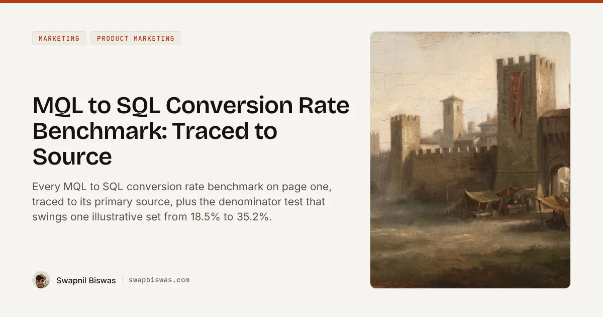
Now keep walking, because the same publisher has a second report. First Page Sage’s B2B SaaS funnel benchmarks, last updated 11 June 2025 and drawn from “50+ B2B SaaS clients over the last decade”, puts MQL to SQL for B2B SaaS at 28% to 46% across 17 verticals, with an unweighted mean of 38.0%. One firm, one metric, one customer type, two published answers roughly three times apart.
That gap is the whole reason an MQL to SQL conversion rate benchmark cannot be lifted off a page and typed into a board deck. It is not a data disagreement between rival research teams. Read the two reports’ own definitions and the cause is sitting in plain text: the industry report puts “indicated intent to make a purchase” and “able to afford the product” both inside the MQL bar, while the funnel report holds both back for the SQL bar and lets fit alone carry the MQL. Move those two qualifying tests one stage down the funnel and the published rate nearly triples. My claim for the rest of this page is that every figure below behaves the same way, and that a benchmark without a stated denominator and a stated qualifying bar is not a benchmark at all.
Every headline MQL to SQL figure on page one, with its provenance status:
| Published figure | Claimed origin, checked | Resolvable primary URL | Sample disclosed | Denominator stated |
|---|---|---|---|---|
| 13%, B2B SaaS | First Page Sage, MQL to SQL by Industry, own client data 2019 to 2025 | Yes | No | No |
| 28% to 46% by vertical | First Page Sage, B2B SaaS Funnel Benchmarks, June 2025 | Yes | 50+ SaaS clients, ten years | No |
| 51% SEO / 46% email / 39% webinar / 30% LinkedIn / 26% PPC | Same First Page Sage funnel report | Yes | Same 50+ clients | No |
| 18% to 22% average, 25% to 35% top quartile | GrowthSpree, no source named on the page | No | No | No |
| 39% to 40% for companies “using behavioral ICP scoring” | GrowthSpree, own-client claim | No | No | No |
| 40% overall, 45% SaaS, 60%+ best in class | Optifai Sales Ops Benchmark | Its own page only, no external validation | Yes, N = 939, Q2 2025 to Q1 2026 | No |
| 32% to 40% blended median | SaaS Hero, credited to “other 2026 benchmarks” and to Artisan Growth Strategies, named without a link | No | No | No |
| Vertical and ACV bands, 8% to 30% | Flighted, no source attached to the vertical table or the ACV bands; the page’s three external citations support other claims | No | No | No |
Three of those eight rows trace to a dated report you can open, and all three come from two documents by the same publisher. None of the eight states what sat in the denominator.
What Is a Good MQL to SQL Conversion Rate?
Nothing published answers that question, and the spread across the eight rows above is why. A good rate is one you computed under a written definition, tracked against your own trailing quarters, and can rebuild six months later from the same query.
If you need an external anchor anyway, use First Page Sage’s B2B SaaS funnel report rather than the industry table, because it discloses a sample and defines its funnel stages, and then match its definitions before you compare. Under those definitions an MQL is a lead who fits the target market or a customer persona, and an SQL is an MQL who has indicated the product is desirable, is within budget, and is speaking with a salesperson. If your own MQL bar already applies an intent test or a budget test, you are measuring a shorter distance and your number will read higher for reasons that have nothing to do with performance.
Three Hops From a Client Dataset to “the Industry Average”
The 13% travels well because it is short, plausible, and attached to a firm name. Watching what happens to it across three hops explains most of what is wrong with benchmark content in this category.
| Hop | What the page says | What survives |
|---|---|---|
| First Page Sage | 13% in the B2B SaaS row of a 30-industry table, data gathered 2019 to 2025, published October 2024 and last modified December 2025 | The figure, the definitions, the date range |
| GrowthSpree | ”The cross-industry average MQL to SQL conversion rate is 13%”, credited to First Page Sage with no link | The firm name. The industry label and the URL are gone |
| Marqeable | The same ~13% labeled “cross-industry average” and credited to “GrowthSpree 2026, agency analysis; echoed by Flighted”, both linked | The two intermediaries. First Page Sage is linked on the same page, but for lead-to-MQL, a different stage |
By the third hop the number is attributed to the pages that quoted it, which is how a single agency’s book of business becomes “the industry average” without anyone lying at any step.
SaaS Hero’s conversion benchmarks looked like the exception when I pulled these pages in September 2026. Its figures carry inline citations throughout: 43 links resolving to 16 distinct targets, every one of them live. I read each href out of the raw HTML. They resolve to syncgtm.com, digitalapplied.com, adv.me, sotrosinfotech.com, thezulumethod.com, articos.com, prospeo.io, konabayev.com, acceleroi.com, foundrycro.com, orbix.studio, pulseahead.com, getperspective.ai and userpilot.com: 14 distinct domains, every one of them a vendor or an agency publishing its own benchmark post rather than an independent study. What they disclose about those numbers varies more than the uniform citation styling suggests. Six of the fourteen state no sample and no method anywhere on the page. The fullest disclosure in the set is Perspective AI’s State of AI Onboarding 2026, whose methodology box gives a sample of 220 PLG SaaS companies at $1M to $200M ARR, a window of Q3 2025 to Q1 2026, a median company size of 45 employees and a median ACV of $14,400. SaaS Hero cites it for a time-to-first-value figure, not for anything in the MQL to SQL tables.
Those tables are worth a second look. SEO-sourced MQLs at 51% and PPC-sourced at 26% are the same two figures First Page Sage publishes for those channels, and on a page carrying 43 citation links, both of those cells are unlinked plain text. The citations on those two rows sit one column over, in the top-quartile column, attached to different numbers: The Zulu Method for “51%+” and Adv.me for “40%”.
Four of those anchors name a research publisher and then point somewhere else. “ChartMogul 2026” and “Kyle Poyar’s analysis of 200 B2B software products for ChartMogul’s January 2026 report” both link to the same Userpilot blog post; “ChartMogul’s 2026 SaaS Conversion Report (n=200)” links to a Pulseahead blog post; “OpenView 2026” links to a Digital Applied blog post. Following the ChartMogul trail one hop further does land somewhere real, because the Userpilot post cites the ChartMogul, Growth Unhinged and ProductLed SaaS Conversion Report, published 4 February 2026 and built on 200 B2B software products. That report measures free-to-paid conversion for self-serve products and carries no MQL to SQL figure at all, so three hops of citation end at a study of a different metric.
This is the same discipline I applied to the SaaS win rate benchmark numbers, and it removed three widely-quoted figures from that post. The failure mode repeats wherever primary research is thin and commercial interest in publishing a number is high.
The Same Records Land Inside Two Published Bands
None of the published bands can arbitrate your number, because you can land in two of them from the same records. The figures here are illustrative, computed for this example and internally consistent so the arithmetic can be checked. One quarter, one B2B SaaS lead flow, one numerator held still at 185 sales-accepted leads: 1,000 MQL records created, 150 of them duplicate re-triggers of people already counted, so 850 unique people; 740 worked by an SDR and 260 never touched before the quarter closed; of the 740 worked, 185 accepted, 340 explicitly disqualified and 215 recycled to nurture.
- Divide by every record created, 185 / 1,000, and the rate is 18.5%.
- Collapse the duplicates first, 185 / 850, and it is 21.8%.
- Divide by the leads an SDR actually worked, 185 / 740, and it is 25.0%.
- Divide by the closed cohort, accepted plus disqualified, 185 / 525, and it is 35.2%.
Read those against the provenance table. At 18.5% the flow sits inside GrowthSpree’s published “B2B SaaS average” of 18% to 22%. At 35.2%, same quarter and same records, it sits at the top of the same page’s “top performers” band of 25% to 35%. Average or elite, decided by a query.
Which of the four is right depends on the question being asked, and that general argument is already worked through on this site rather than here: the win rate post linked above runs the same fork on closed-won data, and feature adoption rate runs it on product usage with a full decision table. What is specific to MQL to SQL is that the choice moves you across two published bands printed on the same page.
One more degree of freedom sits outside the arithmetic: timing. If qualification takes six weeks and you divide this month’s SQLs by this month’s MQLs, you are dividing one population by a different one. Understory Agency’s benchmark page gives the lag real space, telling readers to compare month-three SQLs against month-one MQLs. It also flags that two accurate reports can sit 30 points apart, which is correct and is worth more than the benchmark tables around it.
How to Calculate MQL to SQL Conversion Rate: Five Decisions to Make Once
Five decisions, made once, written next to the metric where the dashboard lives.
- Name the population. Created records, unique people, worked leads, or closed cohort. Write the word in the chart title, not in a footnote nobody opens.
- Deduplicate before you divide. A scoring model that re-fires when a recycled contact downloads a second asset inflates the denominator with the same human being. The 150 duplicates in the illustrative set above cost 3.3 percentage points on their own.
- Fix the lag by cohort, not by month. Tag every MQL with its creation date and follow that cohort forward. Same-month division is the most common source of a rate that swings for no reason.
- Give recycled leads a terminal state. A lead sent back to nurture is neither a win nor a loss, and leaving it floating means it lands in whichever denominator you happen to pick without anyone deciding that it should.
- Publish the qualifying bar next to the number. “22% (MQLs worked, sales-accepted, 45-day cohort)” is a benchmark. A bare 22% is trivia.
The MQL to SQL conversion rate benchmark you build this way will not match anybody’s published figure, and that is the point. It will match your own last eight quarters, which is the only comparison that can carry a target.
MQL to SQL Conversion Rate by Industry and by Channel
Two First Page Sage tables supply nearly every industry and channel figure I traced on this topic, so it is worth reading them in their original form rather than through an intermediary.
The industry table covers 30 industries with data gathered from 2019 to 2025. B2B SaaS sits at 13%, fintech at 11%, cybersecurity at 15%, IT and managed services at 13%, and software development at 14%. The high end belongs to business insurance and HVAC at 26%, the low end to legal services and real estate at 10%. The page names no sample size, and one of its own annotations calls eCommerce “the highest conversion rate of any industry we surveyed” at 23% while two rows in the same table read 26%.
The B2B SaaS funnel report is the more useful of the two, because it discloses its basis and breaks the metric three ways.
| First Page Sage B2B SaaS funnel report, MQL to SQL | Figures |
|---|---|
| By channel | SEO 51%, email 46%, webinar 39%, LinkedIn 30%, PPC 26% |
| By vertical, 17 verticals | Low 28% (insurance SaaS), high 46% (chemical and pharmaceutical SaaS), mean 38.0% |
| By target-customer company size | 32% ($1M to $10M), 39% ($10M to $100M), 39% ($100M to $1B), 40% ($1B+) |
| Stated sample | ”50+ B2B SaaS clients over the last decade”, mostly $10M to $100M revenue |
| Stated denominator | None |
The channel row is the set that recirculates almost verbatim across this category. It is genuine data from a disclosed client base, and the report attaches a condition most republications drop: the benchmarks assume “a high level of competence from the team or agency conducting the activity”, which for PPC means constant landing-page testing and for email means a well-targeted list. A benchmark conditional on execution quality is a ceiling for well-run programs rather than a floor for everyone, and it is a poor forecast input.
One structural warning about the channel table. Channel rates this far apart make the blended company number a mix artifact. Move budget out of SEO and into paid search, and your MQL to SQL conversion rate falls while nothing about your qualification changes, which is the kind of movement that gets a demand gen lead a difficult quarterly review for doing what finance asked.
Why Is the MQL to SQL Conversion Rate So Low?
Four causes, in the order I would check them.
The MQL bar is set to hit a volume target. Marketing is measured on MQL count, so the score threshold drops until the count looks right, and the extra records land in the denominator without landing anywhere near a purchase. This is the seam I have written about as the place B2B funnels break, and no routing automation fixes a bar sales has stopped trusting.
Untouched leads are counted as failures. In the illustrative set above, 260 of the 1,000 records were never contacted. Leaving them in the denominator turns an SDR capacity problem into what looks like a lead quality problem, and the two have opposite fixes.
The metric is measuring an individual while the decision belongs to a group. Forrester’s Terry Flaherty argued in April 2022 that the MQL should be retired on exactly this basis, noting that over 80% of buying decisions are made by a buying group of more than three people. A single scored contact inside a nine-person committee is a weak predictor, and no amount of tuning the score model changes what it is looking at.
The definition was rewritten and the series was not rebuilt. A tightened MQL bar raises the rate the following quarter and makes the prior eight quarters uncomparable. If nobody restates the history under the new rule, the improvement is a measurement artifact that somebody will eventually take credit for.
Why PLG and Developer-Tool Funnels Break the MQL Construct
Two of the pages I read do carry a product-led row. GrowthSpree lists a PLG motion at 25% to 40%, and Flighted lists DevTools and Infrastructure at 14% to 22%. Neither defines what a product-led MQL is, which is the question that decides whether either number means anything.
Look again at how the industry report, the one the 13% comes from, defines the entry gate: an MQL is a contact who has “indicated intent to make a purchase (e.g. by filling out a contact form or reaching out via email)”. That definition cannot see a product-led funnel. A developer who signs up with a work email, wires your CLI into a GitHub Action and runs 400 tests against it in a week has never filled out a form and never emailed anyone. Under the definition behind the figure this category quotes most often, that person is not an MQL, so they never enter the denominator and the rate says nothing about them.
That funnel is not a niche case. In the only dataset I read for this post that states the window its conversion is counted inside, alongside a sample and a date - the ChartMogul, Growth Unhinged and ProductLed study of 200 B2B software products conducted in January 2026 - 57% use a free trial as their primary landing point for new customers and 26% use freemium. Most of that sample acquires through a self-serve entry rather than a form.
The comparable measurement for those funnels has a different shape and its own published benchmark. That study defines its metric as “the percentage of leads or free signups that convert to become a paying customer within six months” and reports a median free-to-paid conversion rate of 8%. Free trials that require a credit card upfront convert at 30%, more than five times the rate of trials that do not.
Setting an 8% median beside an 18% to 22% MQL to SQL band is a category error. The numerators count different events, the denominators count different populations, and only one of the two publishes its window.
What replaces the MQL in these funnels:
| Sales-led construct | Product-led replacement | What has to be written down |
|---|---|---|
| Form fill as the intent signal | A product action with a threshold, such as an integration connected or N runs completed | The exact event and the count that trips it |
| MQL score crossing a number | Product-qualified account, scored on account-level usage rather than one contact | Whether the unit is the user or the workspace |
| Sales accepts the lead | Sales accepts the account for assist, with most accounts never routed at all | The share of qualified accounts that are deliberately left self-serve |
| Monthly MQL to SQL rate | Signup-to-paid within a stated window, plus a separate assist rate | The window, published next to the number |
Two things are specific to developer tools on top of that. The evaluation happens before anyone identifies themselves, in docs, a sandbox and a local install, so the account is frequently anonymous until billing. And the buying group includes engineers who treat an unsolicited qualification call as an interruption, which means a high-usage account can carry strong buying signal and a deliberately low touch count. A funnel where the correct action is often to not route the lead cannot be scored against benchmarks compiled from funnels where routing is the whole job.
If you run one of these motions, the metric set in product-led marketing is a closer fit than anything on this page’s benchmark tables, and the published MQL to SQL figures are best treated as a different sport.
The MQL Definition Is a Product Marketing Deliverable
This metric is owned by demand gen and sales ops, and the argument underneath it is not. The MQL definition encodes who you think the buyer is, which makes it an expression of the ideal customer profile rather than a scoring-model setting, and the ICP sits with product marketing.
That is also the mechanism behind the 13% and the 38%. First Page Sage’s two reports disagree because they encode two different beliefs about when a contact has been qualified, and each belief is a defensible reading of the same two labels.
| Qualification test | Where the industry report puts it | Where the funnel report puts it |
|---|---|---|
| Fits the target market or persona | Not tested on its own; a salesperson vets fit at the SQL bar | MQL bar, and it is the whole bar |
| Indicated intent to buy | MQL bar, “indicated intent to make a purchase” | SQL bar, “indicated that the product is desirable” |
| Can afford the product | MQL bar, “able to afford the product” | SQL bar, “within their budget” |
| Vetted by a salesperson | SQL bar | SQL bar, “speaking with a salesperson” |
| Meeting booked or held | SQL bar | Not required |
Two tests move a full stage between the two reports, and the fit test moves the other way. Read the industry report’s SQL bar closely and it also requires a booked or completed meeting. Its 13% is therefore closer to an MQL-to-meeting rate than to an MQL-to-sales-accepted rate. Anyone holding a sales-acceptance number up against that 13% is measuring a shorter distance against a longer one and reading the difference as performance.
Three pieces of work follow from owning this, none of which is a scoring exercise:
- Write the MQL definition as a sentence about a person, not a point total. “A practitioner at a 200-plus engineer company who has run a pipeline against us” is auditable. “Score above 75” is not.
- Hold the bar when the volume target is missed. Lowering the definition to hit a count converts a demand problem into a trust problem, and trust takes three quarters to rebuild.
- Restate the trailing series whenever the definition changes, and date-stamp the change on the chart. This is the single control that keeps the metric usable across a year.
The upstream targeting question sits in the same place. Sharper demand generation for SaaS produces fewer MQLs that fit better, which raises the rate and lowers the count at the same time, and somebody has to decide in advance which of those two numbers the team is accountable for.
Build Your Own MQL to SQL Conversion Rate Benchmark
The realistic use of external data here is narrow. First Page Sage’s funnel report gives you a defensible shape by channel, drawn from a disclosed client base; the ChartMogul study gives you a self-serve conversion anchor with a stated window; everything else on page one is an agency’s own book of business, carrying a sample size at best and a denominator never.
Build the internal version instead. Rebuild the last eight quarters under one definition, publish the denominator in the chart title, split worked from untouched, and set the target as a movement off your own median with a named lever attached. An MQL to SQL conversion rate benchmark borrowed from a page that will not say what it divided by cannot survive its first serious question.
The denominator is the first thing to write down and the last thing anyone thinks to ask about.
Frequently Asked Questions
What is a good MQL to SQL conversion rate?
No published figure is portable enough to answer that, because none of the widely-quoted ones states its denominator. First Page Sage puts B2B SaaS at 13% in one report and between 28% and 46% in another, and the difference is that the intent and budget tests sit in the MQL bar in one report and the SQL bar in the other, not how the teams performed.
What is the average MQL to SQL conversion rate?
The most-cited number is 13%, which is the B2B SaaS row in First Page Sage's 30-industry table built on its own client data from 2019 to 2025. It is frequently republished as a cross-industry average, which it is not. The unweighted mean of that table's 30 industry rows is 16.1%.
How do you calculate MQL to SQL conversion rate?
Divide sales-accepted leads by a stated population of MQLs over a stated window. The formula is trivial and the denominator is the decision: MQLs created, MQLs actually worked, or a closed cohort that reached a terminal decision. On the illustrative set in this post those three choices produce 18.5%, 25.0% and 35.2%.
Why is the MQL to SQL conversion rate so low?
Usually because the MQL bar is set low enough to hit a volume target, so the denominator fills with contacts nobody intended to buy from. A rate can also read low because untouched leads sit in the denominator, or because this month's SQLs are being divided by this month's MQLs when the qualification lag is six weeks.
Does the MQL to SQL conversion rate vary by channel?
In the only channel dataset on this topic with a disclosed sample, First Page Sage's B2B SaaS funnel report drawn from 50-plus SaaS clients, MQL to SQL runs 51% for SEO, 46% for email, 39% for webinars, 30% for LinkedIn and 26% for PPC. Those five figures recirculate across the category, usually without the report they came from.