Competitive Positioning Map: Template, Example and Teardown
Build a competitive positioning map with a source for every dot: a 5-step method, an axis correlation check, an editable template and the fix for my own map.
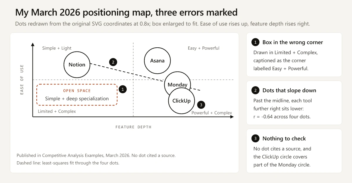
The competitive positioning map I published in March 2026 drew its “OPEN SPACE” box in the corner my own label called “Limited + Complex”. The caption inside the box, “Simple + deep specialization”, describes the opposite corner, the one labelled “Easy + Powerful”, where the same map had already placed Asana.
If you came here for the Semrush report, you want a different chart: Semrush’s map of the same name plots competing domains “based on two metrics: the number of ranking keywords and estimated traffic”, and “larger bubbles signify greater visibility” (Semrush Overview Report documentation, as of October 2026). The Semrush section shows where to find it; the rest of this page covers the marketing chart product marketers draw to compare products.
The fix comes down to one rule: an empty corner on a positioning map means something only when every dot has a source and the two axes measure different things. My March map met neither half of that rule.
What Is a Competitive Positioning Map?
A competitive positioning map is a two-axis chart that plots your product and its rivals on two attributes buyers use to choose between them, such as price and planning features, so you can see who clusters, who stands apart, and which combinations no one offers yet.
How to Make a Positioning Map in Five Steps
- Pick two attributes buyers use to decide, and write a scoring rule for each before you look at any competitor.
- Score every competitor from public evidence, with a URL and a date for each score.
- Check that the two axes measure different things: score each from separate evidence, then run a correlation, and trust it only from five competitors up.
- Plot equal-sized dots, put the labels outside them, and print the sources on the chart (editable template).
- Treat each empty corner as a question for buyers, and check that any white-space box sits in the corner its caption names.
The Three Errors in My March 2026 Positioning Map
The map sat in the positioning and messaging audit of my March roundup of competitive analysis examples. It plotted Notion, Asana, Monday (monday.com) and ClickUp with ease of use rising up the page and feature depth rising to the right, labelled the four corners, and marked one dashed box “OPEN SPACE”. No dot cited a source. Below is the same map, redrawn from the coordinates in its original SVG file, with the errors numbered.
| # | What the map shows | Why it misleads | The fix |
|---|---|---|---|
| 1 | The “OPEN SPACE” box sits in the bottom-left quadrant, labelled “Limited + Complex”, yet its caption reads “Simple + deep specialization” | Read by position, it recommends the “Limited + Complex” corner. Read by caption, it points at “Easy + Powerful”, where the map already put Asana | Write the white-space claim first, then draw the box where it points |
| 2 | Past the vertical midline, each tool further right sits lower: Asana, then Monday, then ClickUp | The dots slope down (r = -0.64 across four dots). On a map where depth costs ease, the bottom-left corner stays empty, so its emptiness says nothing about demand | Run the step 3 check before plotting |
| 3 | No dot cites a source, and the ClickUp circle covers part of the Monday circle | Nobody can check a position, and the overlap hides part of Monday’s caption | One URL and one date per dot, with small dots and outside labels |
The advice under the image invited error 2. It suggested “ease-of-use vs power” as an example pair, and when one person scores both of those from impressions, a belief that power costs simplicity lands in both scores. The map also showed four tools, below the “at least 5 to 10 competitors” that OpenStax’s Principles of Marketing suggests.
Perceptual Map vs Positioning Map: Where the Scores Come From
OpenStax treats the two names as one chart: its section “Perceptual Positioning Maps and How They Are Used” defines a perceptual map as “a visual diagram that shows how the average target market consumer perceives your product versus those of your competitors”. Wikipedia’s perceptual mapping article names the other kind: “intuitive maps (also called judgmental maps or consensus maps) that are created by marketers based on their understanding of their industry. These are limited by not being based on consumer data.”
The name on the chart matters less than the source of its scores:
| Map | Where the scores come from | What it can tell you | In this post |
|---|---|---|---|
| Perceptual map | Customer research: surveys, interviews, rating studies | How buyers see you next to rivals | Not built here: I have no buyer data for these tools |
| Judgmental (intuitive) map | The marketer’s own understanding of the market | A hypothesis worth testing | My March 2026 map |
| Judgmental map with sourced dots | Public evidence, one URL and date per dot | What vendors publish, which anyone can check | The rebuild below |
A judgmental map is a fine whiteboard sketch. My mistake was publishing one as if it were a finding.
How to Build a Positioning Map From Public Evidence
The worked example keeps the original four tools so the before and after compare like with like, which leaves it below OpenStax’s 5 to 10 as well; step 3 shows what that costs.
Step 1: Name the Buyer and Two Attributes
- Buyer: a small team choosing its first paid plan of a work management tool.
- X axis: the price of each vendor’s entry paid plan, in US dollars per seat per month, billed annually.
- Y axis: how many of three planning features that plan includes: a timeline or Gantt view, native time tracking, and portfolios.
- Scoring rule: a feature counts when the vendor’s pricing page lists it on that plan; where a pricing page says nothing, the vendor’s help center decides.
Ease of use is off the map. I have no customer research on how these tools feel to use, so any ease score I wrote would be as unsourced as the March ones. If you have interview notes or usability results, ease belongs on a perceptual map scored from that data.
Step 2: Score Each Competitor With a Source and a Date
USD list prices, billed annually, as each vendor’s pricing page showed them on 2 October 2026:
| Tool | Entry paid plan | Price per seat | Timeline or Gantt | Native time tracking | Portfolios | Score |
|---|---|---|---|---|---|---|
| Asana | Starter | $10.99 | Yes | From Advanced ($24.99) | From Advanced ($24.99) | 1 |
| monday.com | Basic | $9 | From Standard ($12) | From Pro ($19) | Enterprise plan | 0 |
| ClickUp | Unlimited | $7 | Yes | Yes | Yes | 3 |
| Notion | Plus | $10 | Timeline view (help center) | Not listed | Not listed | 1 |
The feature count is still my judgment about which three features matter to this buyer. The difference from March is that every cell can be checked, and anyone who weighs the features differently can swap one column and replot. Comparing feature parity row by row is a different job; a map keeps only the two attributes buyers decide on.
Step 3: Check the Axes Measure Different Things
Put the two score columns in a sheet and use CORREL, which “Calculates r, the Pearson product-moment correlation coefficient of a dataset” (Google Docs Editors Help). An r near +1 or -1 means the dots fall along one line and the second axis adds little. Below five competitors, r swings with any single dot, so it cannot settle the question alone; leaving each tool out in turn shows how far it moves.
| Map | r across all four | r with one tool left out |
|---|---|---|
| March 2026: ease of use vs feature depth, from the SVG coordinates | -0.64 | -0.53 to -0.97, negative every time |
| Rebuilt: entry price vs planning features | -0.66 | +0.87 without ClickUp; -0.66 to -0.97 otherwise |
How to read it:
- The two maps have almost the same r, so the full-set number cannot tell them apart.
- The March sign holds with any tool removed, but at four dots that is not proof of a trade-off.
- The rebuild’s sign flips without ClickUp: Asana, monday.com and Notion line up as pay more, get more (+0.87). Its r needs more competitors before it counts either way.
- The check that keeps the rebuild’s axes, and fails the March ones, needs no arithmetic: does each score come from separate evidence? No March score cites any. On the rebuild, each price is a number on a pricing page and each feature count is a tally of what the vendor lists for that plan, and the two can move apart: monday.com keeps Gantt views for its $12 Standard plan while ClickUp includes them at $7.
- A workable rule of thumb: across five or more competitors, treat an r beyond plus or minus 0.7 as a reason to go back to step 1 for a new axis.
Step 4: Plot Equal Dots and Print the Sources

- Dots share one size unless size encodes a third measured attribute. On the March map, size carried nothing and the large circles collided.
- Labels sit outside the dots, so a crowded cluster stays readable.
- Each dot carries a number that matches a dated source list on the chart, so the image keeps its evidence when someone pastes it into a deck.
Step 5: Read the White Space as a Question for Buyers
ClickUp sits alone in the top left: the lowest entry price of the four ($7) and all three planning features. Its pricing page leads with “The best work solution, for the best price.” This map can check only the price half of that claim, and only against three rivals. Asana, monday.com and Notion sit between $9 and $10.99 with zero or one of the three, and sell the rest as upgrades or list them on no plan.
| Empty corner | What a product there would offer | When it counts as white space |
|---|---|---|
| Top right: all three features on an entry plan priced above $9 | The same planning kit as ClickUp, for more money | Only with a third advantage this map does not plot, such as ease of use, and buyers who say they would pay for it |
| Bottom left: under $8 with none of the three | A low-cost plan for teams that only need lists and boards | Only if those buyers show up in your pipeline or lost-deal notes |
My March map skipped this step: asked as a question, its “OPEN SPACE” corner becomes “does anyone want a tool that is hard to use and has few features?”, which answers itself. Test a white-space idea in buyer interviews, such as the customer-interview week of this market positioning workshop, before it reaches a product positioning statement.
Axis Pairs That Measure Two Different Things
Choose the pair by the decision the map has to inform. If you keep a competitive analysis template, its pricing-model and positioning columns already hold part of this evidence.
| Decision the map informs | X axis | Y axis | Evidence per dot | Watch for |
|---|---|---|---|---|
| Packaging and price | Entry plan price per seat | Key features on that plan | Pricing pages | Prices move: date every dot |
| Which buyers to target | Sales motion: free plan, trial or “contact sales” | Size of the customers in published case studies | Pricing page, customer stories | Count every story, not the homepage logos |
| Category and message | Jobs the homepage claims: a count of distinct jobs in the hero and first section | How specific the buyer named in the hero is: 0 none, 1 a role, 2 a role plus company size or industry | Homepage hero and first section | Headlines change: keep a dated screenshot |
| Integration strategy | Native integrations listed | Planning features on the top plan | Integrations directory, pricing page | Count native integrations only |
| How buyers see you (perceptual) | Ease of use as rated by your buyers | Value for money as rated by your buyers | Your own survey or interview scores | Report the sample size |
| Pair to avoid | Ease of use you scored yourself | Feature depth you scored yourself | None | Two scores with no source behind either, as on my March map |
The Semrush Competitive Positioning Map Is a Search Chart
Semrush’s knowledge base uses the name for bubble charts of competing domains in Domain Overview and Advertising Research, and describes a similar graph in Organic Rankings. As of October 2026:
| Where in Semrush | What it plots, in Semrush’s words | Bubble size |
|---|---|---|
| Domain Overview, Overview report: Competitive Positioning Map (Organic) | Competitors “based on two metrics: the number of ranking keywords and estimated traffic" | "larger bubbles signify greater visibility” |
| Same report: Competitive Positioning Map (Paid) | Competitors “based on their paid search visibility" | "Larger bubbles indicate domains with greater paid search visibility” |
| Advertising Research, Competitors report | X-axis: number of paid keywords; Y-axis: estimated paid traffic | Estimated traffic cost |
| Organic Rankings, Competitors report: an unnamed graph the KB calls “a unique graph” | Main competitors “according to their number of organic keywords and traffic” | Not described |
The Semrush chart tells you who you compete with in search and how big they are there. Use it to choose which competitor domains to study, and the marketing map to decide what to claim against them.
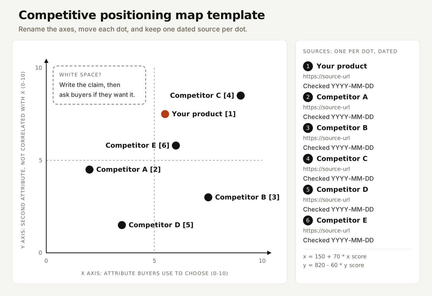
Competitive Positioning Map Template: Editable SVG and CSV
The template is a plain SVG file, the same format the rebuilt map above started as, so it opens in a text editor or a vector design tool.
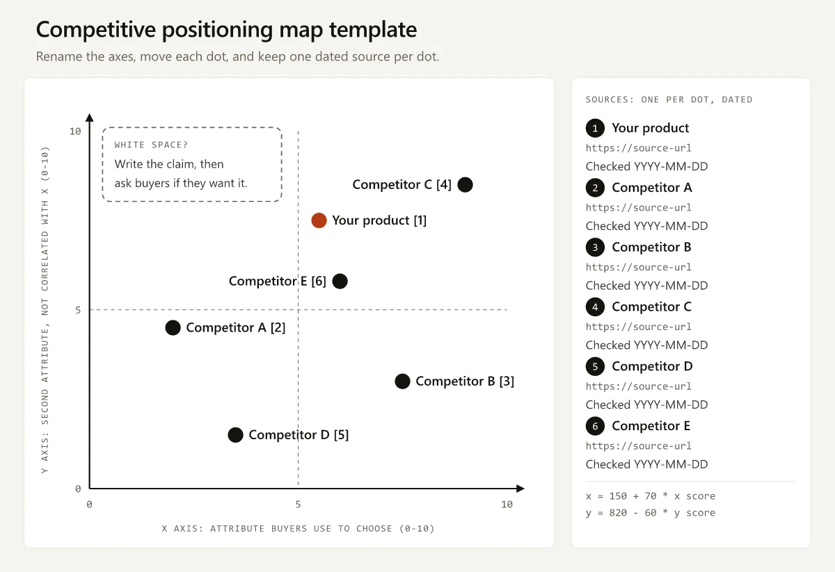
- Editable SVG template: each dot is a group with a
translate(x,y)value. For scores out of 10,x = 150 + 70 * scoreandy = 820 - 60 * score. Rename the axis titles and write one dated source per dot. - CSV scoring sheet: the four rows from this page plus blank rows for your product and competitors A to E, named as in the template.
- In Google Sheets, click File > Import (Google’s import steps), select the two score columns, click Insert > Chart, and pick Scatter under Chart type in the Setup tab (Google’s chart steps). To show names on the dots, follow Google’s steps for adding notes to a data point and enter A2:A5, the names column, as the label range.
- In Excel, select the same two columns, then on the Insert tab choose Insert Scatter (X, Y) or Bubble Chart and pick a type under Scatter (Microsoft’s scatter chart steps).
- Put
=CORREL(C2:C5, D2:D5)under the scores for the step 3 check, and widen the ranges, labels included, as you add rows. Excel’s CORREL takes the same two ranges (Microsoft’s CORREL reference).
Before You Present Your Map
- Every dot has a URL and a date, printed on the chart.
- Each axis is scored from separate evidence, and the correlation has been run across every competitor.
- The white-space box matches its caption, and buyer interviews back that corner.
- The chart says whether it is a perceptual map built on buyer data or a judgmental one built on your evidence.
My March 2026 map would have failed every one of those checks. The rebuild passes all but the third, which needs buyer interviews I have not run. Before a competitive positioning map goes into a deck, fill in its source column.
Frequently Asked Questions
What is a competitive positioning map?
A competitive positioning map is a two-axis chart that plots your product and its rivals on two attributes buyers use to choose, such as price and features. It shows who clusters, who stands apart and which combinations nobody offers; an empty corner means something only when every dot has a source and the two axes measure different things.
What is the difference between a perceptual map and a positioning map?
OpenStax's Principles of Marketing treats them as one chart, in a section headed Perceptual Positioning Maps and How They Are Used. The difference that matters is the data: a perceptual map is scored from customer research, while a judgmental map, also called an intuitive map, is scored from the marketer's own understanding of the market.
How do you choose the axes for a positioning map?
Pick two attributes buyers use to decide between the options, write a scoring rule for each, and score each from separate evidence. Then check the scores with CORREL in a spreadsheet; if r is beyond plus or minus 0.7 across five or more competitors, treat that as a reason to test a new axis.
How many competitors should a positioning map include?
OpenStax's Principles of Marketing suggests at least 5 to 10 competitors. With fewer than five, a correlation moves with any single dot, so score each axis from separate evidence before trusting an empty corner.
What is the Semrush Competitive Positioning Map?
It is a Semrush bubble chart of competing domains. Semrush's knowledge base says the organic version plots competitors by the number of ranking keywords and estimated traffic, with larger bubbles for greater visibility, so it sizes search competitors rather than product positions.