Van Westendorp Price Sensitivity Meter: How to Run It
How to run the Van Westendorp price sensitivity meter end to end: the four questions, cleaning illogical responses, reading the crossings, and its real limits.
Suppose a product manager wants a new tier shipped. Sales says $79 a seat is where the deals stall. Finance holds a margin floor at $28. Two enterprise prospects have volunteered that they would pay “whatever the incumbent charges,” which nobody in the room can price. Every one of those inputs is real, and none of them settles what number goes on the pricing page. The Van Westendorp price sensitivity meter exists for exactly that gap.
The four questions and the picture of the crossing lines are the easy half, and they are where most write-ups stop. The parts that decide whether the output is worth carrying into a pricing meeting come after: how many responses you need before the crossings stop moving, what to do with the respondents whose answers are logically impossible, what each of the four intersection points actually licenses you to say, and the fact that the method measures stated price acceptability with no measure of whether anyone would buy.
Here is what the four questions ask and what each one is doing.
| # | Question, as printed by SurveyMonkey | What it is for |
|---|---|---|
| 1 | ”At what price would you consider the product/service to be priced so low that you feel that the quality can’t be very good?” | Finds the floor where cheapness becomes a quality signal against you |
| 2 | ”At what price would you consider this product/service to be a bargain[,] a great buy for the money?” | Finds where price becomes an active reason to buy |
| 3 | ”At what price would you say this product/service is starting to get expensive[,] it’s not out of the question, but you’d have to give some thought to buying it?” | Finds where price becomes friction in the deal |
| 4 | ”At what price would you consider the product/service to be so expensive that you would not consider buying it?” | Finds the walk-away ceiling |
Wording is quoted from SurveyMonkey’s market research resource, with bracketed commas standing in for the dashes in the original. Every answer is an open price box. Nobody is shown a price to react to, which is the method’s biggest strength and the root of most of its problems.
What Is the Van Westendorp Price Sensitivity Meter?
The Van Westendorp price sensitivity meter is a four-question survey instrument that converts open-ended price answers into four cumulative curves and reads a band of acceptable prices from where those curves intersect.
Peter van Westendorp presented it as the NSS Price Sensitivity Meter at the ESOMAR congress in 1976, in a paper described in the ESOMAR archive as “a new technique for the measurement of price-perception in surveys” with an approach that is psychometric. The full citation, as carried in the reference list of the pricesensitivitymeter R package, is NSS-Price Sensitivity Meter (PSM) - A new approach to study consumer perception of price, Proceedings of the ESOMAR Congress, pages 139 to 167.
Two things in that description matter.
- It is a measure of price perception, not of demand. The instrument asks what a price feels like to a person. It does not ask, and cannot answer, how many units sell at that price.
- It was built for consumer price perception. The ESOMAR record tags the paper Consumer Perception, and its own subtitle is “a new approach to study consumer perception of price.” Nothing in four open price boxes anticipates a per-seat subscription approved by someone who never uses the product.
What you get out of it is a range with four labeled points inside it. That is worth having when you have no reference price at all, and it is why the method survived fifty years despite the complaints stacked against it, several of which appear later in this post. Four questions, no stimulus design, no choice sets, no conjoint budget. For a first pass on a category you have never priced, nothing else is that cheap.
What Is Price Sensitivity?
Price sensitivity is how much a buyer’s willingness to purchase moves when the price moves. High price sensitivity means a small increase pushes buyers out. Low price sensitivity means the same increase barely registers.
Price elasticity is the measured form of the same idea: the percentage change in quantity demanded divided by the percentage change in price. Sensitivity is the behavior; elasticity is the number you put on it. Van Westendorp measures neither directly. It measures where the price stops feeling reasonable, which is a perception layer sitting above both.
Buyer, Customer and Consumer Price Sensitivity Are Different Problems
The three phrases get used interchangeably. They describe three different research problems.
| Phrase | Who is answering | What their reference price is |
|---|---|---|
| Consumer price sensitivity | A person spending their own money on their own behalf | What they last paid, and what sits next to it on the shelf or the results page. This is the case Van Westendorp was designed for |
| Customer price sensitivity | An existing account | Their current invoice, with switching costs sitting between them and any alternative |
| Buyer price sensitivity in B2B | A person spending someone else’s money, against a budget line, with a procurement process attached | The threshold above which the purchase needs a second signature |
Ask an existing customer the four questions and you measure their tolerance for a change from a known number, not their valuation of the product. A B2B buyer’s “too expensive” is often not a valuation either. That threshold is real and worth knowing, and it is not what the question is asking.
Run one study across a mixed sample of all three and the curves you plot are an average of three different mental models. The crossings will land somewhere, and they will mean nothing.
What Price Sensitivity Analysis Measures
Price sensitivity analysis splits into stated methods and revealed methods.
| Family | What it observes | Where it shows up | The trade-off |
|---|---|---|---|
| Stated | What people say they would do | Van Westendorp, Gabor-Granger, most conjoint work | Fast, cheap and hypothetical |
| Revealed | What people actually did | Price tests, discount-band analysis on closed-won deals, win-rate curves by list price, cohort behavior after a price change | Slower and better, and it needs a product already in market |
Van Westendorp is the most stated of the stated methods, because the respondent supplies the number instead of reacting to one. That distance from real behavior is the single fact that should shape how you use the output. For the psychological machinery underneath those stated numbers - anchoring, reference prices, the charm-price effect - the pricing psychology that moves B2B SaaS buyers covers what the survey cannot see.
How Many Responses the Van Westendorp Method Needs
Each of the four curves is an empirical cumulative distribution built from the sample. A crossing point is where two of those step functions meet. The precision of the crossing is the precision of two proportions, which means the standard error is straightforward arithmetic.
For a cumulative share p estimated from n responses, the standard error is sqrt(p * (1 - p) / n). At the worst case of p = 0.5:
| Usable responses | Standard error at 50% | 95% interval |
|---|---|---|
| 50 | 7.1 points | plus or minus 13.9 points |
| 100 | 5.0 points | plus or minus 9.8 points |
| 200 | 3.5 points | plus or minus 6.9 points |
| 400 | 2.5 points | plus or minus 4.9 points |
| 800 | 1.8 points | plus or minus 3.5 points |
Percentage points are not dollars, so the number that matters is how steep the curves are where they cross. In the worked example below, the “too expensive” curve climbs about 1.25 percentage points per dollar between $40 and $60. Feed the table into that slope:
- At 200 usable responses, plus or minus 6.9 points is plus or minus $5.50 around the crossing price.
- At 100 usable responses, plus or minus 9.8 points is plus or minus $7.80.
- At 50 usable responses, it is plus or minus $11.10, which is a $22 window on a crossing in the low $40s.
Expect flatter curves in B2B than in consumer work, which makes this worse: the spread of stated prices across a buying committee is wider, so the same swing in percentage points stretches over more dollars.
My rule: I would not take a Van Westendorp result into a pricing decision below roughly 200 usable responses per segment, counted after the cleaning step, and I would not cut a segment below 150. Below that the crossings are decoration. The instinct to segment a 240-response study into four verticals of 60 is where most of these studies die, because four unstable answers look more decisive than one stable one.
Sample Composition for a Price Sensitivity Study
Sample size is the easier half of the problem. Sample composition decides whether the number means anything.
| Composition decision | What it costs you to skip it |
|---|---|
| Screen on the buying decision, not on the firmographic | A panel of “marketing managers at companies with 200 to 1,000 employees” will contain people who have never approved a software purchase, and their price answers are guesses about their employer’s tolerance rather than statements about their own. Screen instead for whether the respondent has approved, vetoed or built the business case for a purchase in this category in the last twelve months |
| Keep prospects and existing customers in separate cells | A customer’s four answers are anchored on their current invoice, which makes their curves narrower and lower than a prospect’s. Pooling the two produces a range that describes neither, and if the customer share in your sample does not match your future pipeline mix, the bias is not recoverable afterwards |
| Decide the geography before fielding, not after | A global sample mixes reference prices that were never comparable, so the crossings it produces do not describe any single market |
| Recruit for the concept, not the category | If the description you are pricing includes a capability the respondent has never used, they will price the familiar part and ignore the rest |
That last one is why customer discovery interviews belong before the survey rather than after it.
Clean the Responses Before You Plot Anything
The four answers from a single respondent have to be in increasing order. The pricesensitivitymeter R package states the constraint explicitly in its analysis function documentation: the validate argument asks whether “only respondents with consistent price preferences (too cheap < cheap < expensive < too expensive) be considered in the analysis,” and it defaults to TRUE. Respondents who fail are dropped before anything is plotted.
The violations that show up in raw returns:
- Too cheap above bargain. The person read the first question as “cheapest I would pay” rather than “so cheap it worries me.”
- Bargain above expensive. Usually a straight data-entry slip, or a respondent working in a different unit for one answer (annual instead of monthly).
- Expensive above too expensive. The last two questions are the hardest pair to hold apart, and in B2B samples they are the pair I check first.
- Ties. Two identical answers are not strictly increasing, so the constraint above excludes them. Check what your own script does with them, because people who assume only inversions count are surprised by the loss.
- Zeros and round refusals. A row of 0s or a 999 in the last box is a person declining the question, not a data point.
How much this costs you is not small. The README for the same R package builds its demo dataset from four independent normal draws, and 107 of the 250 simulated respondents fail the transitivity check, leaving 143 analyzed. That is simulated data with no respondent care applied at all, so treat 43% as the ceiling rather than a forecast. It does show that a coherent ordering is a real constraint, not a formality that most answers satisfy by accident.
One published study that pre-screened hard did much better. The 2025 Frontiers in Public Health study of willingness to pay for HPV vaccines among Chinese college students retained 4,928 valid questionnaires for a 91.53% validity rate, excluding 456 responses in total: 199 for completion times under 180 seconds, 212 for unverifiable academic or professional information, and 45 for logical inconsistencies. The paper does not define its logical-inconsistency criterion, so those 45 cannot be read as price-ordering failures and the figure is not comparable to the 43% above.
Two practical moves cut the loss before it happens:
- Validate in the survey tool, at the question. A constrained slider or a live check that rejects a lower number than the previous answer removes almost all inversions at source.
- State the unit in every question, not once at the top. “Per seat, per month, on an annual contract” belongs inside all four question stems.
Dropping intransitive respondents is not a neutral act. The people who cannot produce four ordered prices are disproportionately the people with no stable reference price for the category, which is the least category-literate part of your sample. Clean the data and you also concentrate it on buyers who already know what this kind of product costs. For a mature category that is fine. For a new category the cleaning step deletes the segment you were trying to learn about, so report the drop rate next to the result and say which case you are in.
How to Build the Four Price Sensitivity Curves
The curves are cumulative shares across a price grid. Two run down, two run up.
- Build a price grid covering the full span of answers. Whole dollars is fine; a finer grid does not add information a 200-person sample can support.
- Too cheap at price
pis the share of respondents whose “too cheap” answer is greater than or equal top. It starts at 100% and falls. - Cheap / bargain at
pis the share whose bargain answer is greater than or equal top. Also falls. - Expensive at
pis the share whose “expensive” answer is less than or equal top. It starts at 0% and rises. - Too expensive at
pis the share whose “too expensive” answer is less than or equal top. Also rises. - Plot all four against price and read the intersections.
The construction error to check for first is a bargain curve plotted ascending like the expensive curve. It looks plausible on the chart and it puts every crossing in the wrong place. The two “cheap side” curves descend; the two “expensive side” curves ascend.
In Excel, put each respondent’s four answers in columns B through E, put the price grid in column G, and use two formulas across 200 rows:
Descending (too cheap, bargain):
=COUNTIF($B$2:$B$201,">="&$G2)/COUNT($B$2:$B$201)

Ascending (expensive, too expensive):
=COUNTIF($D$2:$D$201,"<="&$G2)/COUNT($D$2:$D$201)
Fill down the grid, then chart all four series as a scatter with straight lines. Do not smooth the lines. Smoothing invents curvature between grid points and moves the crossings.
Troubleshooting the Chart
Broken Van Westendorp charts are diagnosed from the response rows rather than from the picture.
| Symptom on the chart | Cause in the data | Fix |
|---|---|---|
| The curves never cross | One series is built in the wrong direction | The two cheap-side series should start near 100% at the left edge and the two expensive-side series near 0%. If all four leave from the same corner, one formula has the comparison operator the wrong way round |
| The point of marginal cheapness sits above the point of marginal expensiveness, so the band has no width | Noise on a small sample. On a large one, two populations with different reference prices pooled into one chart | Split the populations and plot each on its own axes |
| The too-cheap curve never reaches zero | A few respondents named a too-cheap price above most people’s too-expensive price. They passed the transitivity check because their own four answers were ordered | Inspect the top and bottom 2% of every column and settle your outlier rule before you look at the crossings, not after |
| Long flat stretches with no data | The price grid is finer than the sample can support. Two hundred responses across a $200 span on a $1 grid gives mostly empty steps | Widen the grid until each step contains movement |
A Price Sensitivity Example: 24 Responses, Four Crossings
Here is a full run on a fictional B2B analytics tool priced per seat per month. Twenty-four raw responses, four of them unusable.
| Respondent | Too cheap | Bargain | Expensive | Too expensive | Valid |
|---|---|---|---|---|---|
| R01 | 5 | 12 | 25 | 40 | yes |
| R02 | 10 | 20 | 40 | 60 | yes |
| R03 | 15 | 30 | 50 | 75 | yes |
| R04 | 20 | 35 | 60 | 90 | yes |
| R05 | 45 | 30 | 55 | 80 | no, too cheap above bargain |
| R06 | 25 | 45 | 70 | 100 | yes |
| R07 | 8 | 18 | 30 | 50 | yes |
| R08 | 30 | 55 | 85 | 120 | yes |
| R09 | 20 | 65 | 45 | 95 | no, bargain above expensive |
| R10 | 12 | 25 | 45 | 65 | yes |
| R11 | 35 | 60 | 95 | 140 | yes |
| R12 | 18 | 32 | 55 | 85 | yes |
| R13 | 25 | 50 | 110 | 90 | no, expensive above too expensive |
| R14 | 6 | 15 | 28 | 45 | yes |
| R15 | 40 | 70 | 100 | 150 | yes |
| R16 | 22 | 40 | 65 | 100 | yes |
| R17 | 10 | 22 | 38 | 55 | yes |
| R18 | 28 | 48 | 75 | 110 | yes |
| R19 | 24 | 24 | 60 | 95 | no, tie on the first two |
| R20 | 16 | 28 | 48 | 70 | yes |
| R21 | 50 | 80 | 120 | 180 | yes |
| R22 | 14 | 26 | 42 | 62 | yes |
| R23 | 32 | 58 | 90 | 130 | yes |
| R24 | 9 | 19 | 35 | 58 | yes |
Twenty valid responses out of 24, a 17% drop rate. Now the cumulative shares, computed over those 20 and printed at $10 steps so the whole span fits:
| Price | Too cheap | Cheap | Expensive | Too expensive |
|---|---|---|---|---|
| $10 | 80% | 100% | 0% | 0% |
| $20 | 45% | 80% | 0% | 0% |
| $30 | 25% | 55% | 15% | 0% |
| $40 | 10% | 40% | 30% | 5% |
| $50 | 5% | 25% | 50% | 15% |
| $60 | 0% | 15% | 60% | 30% |
| $70 | 0% | 10% | 70% | 45% |
| $80 | 0% | 5% | 75% | 50% |
| $90 | 0% | 0% | 85% | 60% |
| $100 | 0% | 0% | 95% | 70% |
The crossings do not sit on those $10 steps. They are read off the same four columns computed at every whole dollar, and four pairs meet inside the grid: the point of marginal cheapness (PMC), the optimal price point (OPP), the indifference price point (IPP) and the point of marginal expensiveness (PME).
| Price | Too cheap | Cheap | Expensive | Too expensive | Crossing |
|---|---|---|---|---|---|
| $33 | 15% | 45% | 15% | 0% | PMC, too cheap meets expensive |
| $41 | 5% | 35% | 30% | 5% | OPP, too cheap meets too expensive |
| $42 | 5% | 35% | 35% | 5% | IPP, cheap meets expensive |
| $56 | 0% | 20% | 55% | 20% | PME, cheap meets too expensive |
Range of acceptable prices: $33 to $56 per seat per month, running from the point of marginal cheapness to the point of marginal expensiveness.
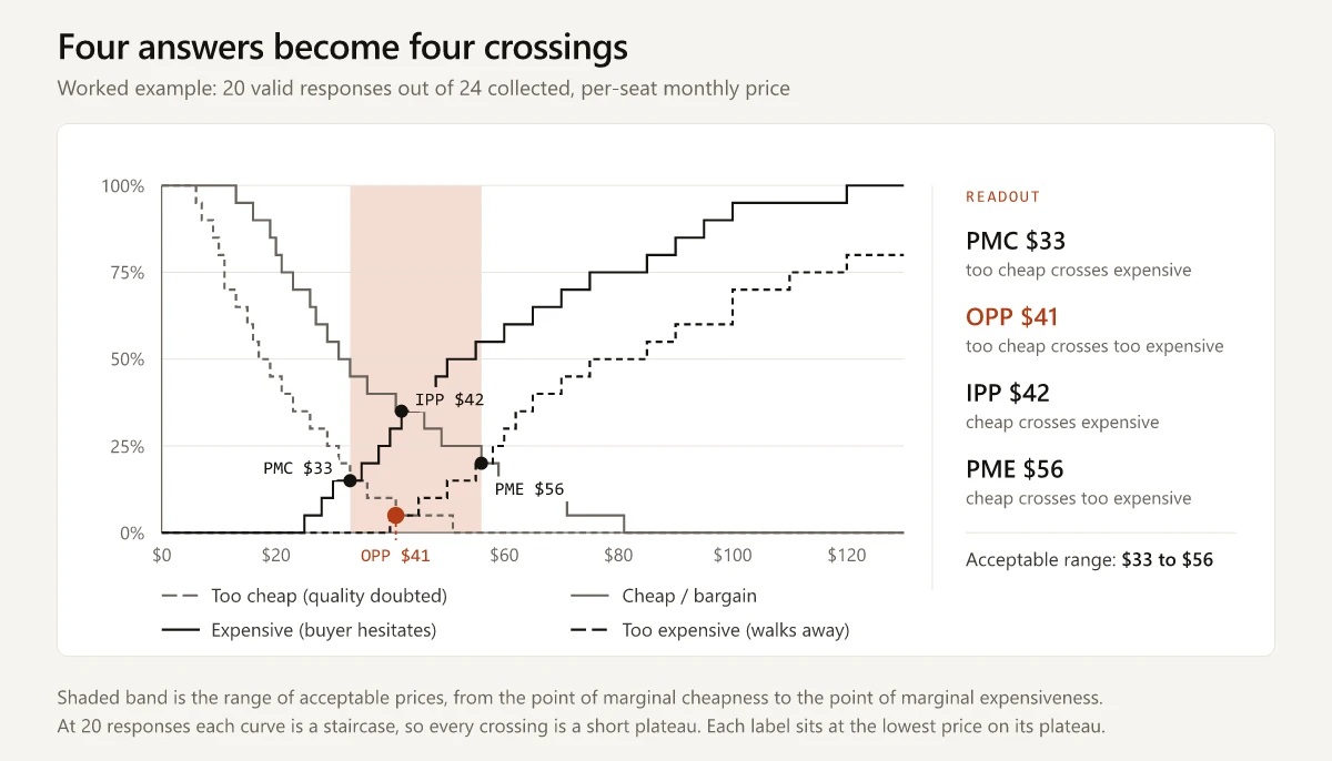
None of those four crossings is a point. At 20 responses each curve is a staircase, so two curves that meet sit on top of each other for a stretch instead of touching and separating.
| Crossing | Prices where the two curves are equal | Share |
|---|---|---|
| PMC | $33 to $34 | 15% |
| OPP | $41 to $44 | 5% |
| IPP | $42 to $44 | 35% |
| PME | $56 to $57 | 20% |
I label each crossing at the lowest price on its plateau. That is a convention, not a measurement, and it belongs in the footnote of any chart you hand to someone else.
One respondent is worth 5 percentage points at n = 20. At the roughly 1.25 points per dollar slope of the too-expensive curve, moving a single answer shifts a crossing by about $4. The $33-to-$56 range in this example is a demonstration of the arithmetic, not a finding. This is the sample-size table from the previous section made concrete.
The OPP and the IPP land $1 apart, and their plateaus overlap almost entirely. At n = 20 the two points are not distinguishable, so any story about the distance between them is a story about which end of a plateau got labeled. Read that gap only when the sample is large enough that 2 percentage points of curve movement is smaller than the gap you are reading.
Reading PMC, OPP, IPP and PME
Each point answers a narrower question than its name suggests. Sawtooth Software’s breakdown of the model defines the acceptable price range as “the range between the point of marginal cheapness and point of marginal expensiveness,” and the same page is blunt about what the range leaves out.
| Point | What crosses | What it licenses you to say | What it does not say |
|---|---|---|---|
| PMC | Too cheap x expensive | Below this, the quality doubt starts outweighing the hesitation about price | That you should price here |
| OPP | Too cheap x too expensive | This price draws the fewest outright rejections in either direction | That this price maximizes revenue or profit |
| IPP | Cheap x expensive | The sample splits evenly between calling this cheap and calling it expensive | That this is a market median or a competitor price |
| PME | Cheap x too expensive | Above this, walk-aways start outweighing bargain perception | That this is your ceiling |
“Optimal” is doing a lot of unearned work in the name. The optimal price point minimizes the count of people who reject the price for being wrong in either direction. It optimizes rejection, and rejection is not revenue. Sawtooth states the consequence directly: the acceptable range “may not account for cost structures, profitability margins, or strategic positioning.”
The indifference price point gets misread even more often, usually as “the market price.” Quantilope’s pricing model breakdown puts it plainly: the IPP “isn’t advised as the price to set,” though it can guide you when the optimal price point is too low to work as a business.
The honest summary is that the four points bound a conversation. They do not end one. If your pricing committee wants a number, the range is your input to that decision, not the decision. The step-by-step pricing strategy playbook puts willingness-to-pay research first for that reason: it is the first of several inputs, and the model and packaging decisions that follow will move the number again.
Where the Van Westendorp Price Sensitivity Meter Reads Low
Two practitioner critiques say the method’s output comes in under what buyers actually pay. Conjointly’s methodology page puts the mechanism on the elicitation format: “Because it is a ‘direct’ pricing technique, respondents are prone to underestimating the price levels they specify.” Michaela Mora grounds the same complaint in her own client work, writing in June 2023 in her case against the method that its “results suggest price ranges consistently lower than what customers pay in reality.”
Neither is a controlled comparison against real transactions, so this is the field’s shared impression rather than a measured bias, and you should hold it as one. My own reading of why it would point down sits in the question format. An open price box costs a respondent nothing for naming a low number, and there is no budget, no consequence, no competitor on screen and no salesperson explaining the value pushing in the other direction. A Gabor-Granger question makes the respondent reject a specific price that someone has evidently already considered charging, which is a different psychological act.
Sawtooth names two structural gaps that sit underneath the complaint:
- “(without the Newton-Miller-Smith extension) the Van Westendorp method doesn’t directly predict purchase behavior or sales volume at different price points.”
- “The method doesn’t ask consumers to make a choice among the firm’s product and available competitors, given specific prices.”
The HPV vaccine study above shows what a ceiling below the market price looks like in practice, though not as evidence of a method bias. Its Van Westendorp analysis of the imported nine-valent vaccine returned an optimal price point of 1,061.19 CNY and an acceptable price range of 942.42 to 1,204.80 CNY, against a market price of 1,331.00 CNY. The authors read the 126.2 CNY gap as “a significant affordability barrier,” not as a fault in the instrument, and the sample supports their reading: respondents were students at a single university with a mean age of 20.69, and the nine-valent price analysis rests on the 2,902 of them who both said they would pay out of pocket and preferred that vaccine. That is a sample-composition result of exactly the kind the composition section warns about, and it is worth carrying for that reason. It is the shape you get when you field to the wrong population: a tidy range, four labeled points, and a market clearing above all of them.
Two more limits worth holding on to:
- The method studies one product configuration at a time. Sawtooth notes it is “typically limited to studying a single or a very few product formulations.” Ask it about a three-tier packaging decision and you are running three separate studies with no shared trade-off structure.
- The four questions assume the respondent already has a price in mind, and nothing in the wording supplies one. In a category with no established price, the answers describe what the respondent can imagine rather than what the market does. The 1976 abstract does not state this as an assumption; it follows from asking for four unanchored numbers.
What to do with all of that: treat PME as the top of the range the survey can see, not the top of the range the market will bear. If your commercial instinct says the real ceiling is higher, the survey is not evidence against you. Test it directly.
The Newton-Miller-Smith Extension Adds the Missing Purchase Intent
The gap has had a documented fix since 1993 and it still gets skipped. Newton, Miller and Smith published a market acceptance extension to price sensitivity measurement that year, cited in the same R package reference list as A market acceptance extension to traditional price sensitivity measurement, Proceedings of the American Marketing Association Advanced Research Techniques Forum.
The extension adds two questions. After the four price questions, each respondent is asked how likely they would be to buy at their own stated “cheap” price, and how likely at their own stated “expensive” price, usually on a five-point scale. Because each respondent is scored at their own price points rather than a shared grid, the two answers can be interpolated across the sample.
What that buys you, per the package documentation, is two estimates the base method cannot produce: the price with the highest reach, meaning trial rate, and the price with the highest revenue given that reach. A demand read and a revenue read, from two extra questions.
Sawtooth’s own question library ships the pairing. Its van Westendorp entry describes a survey where “respondents complete a van Westendorp question, followed by two Newton-Miller-Smith questions.”
If you are running the four questions, run the six. Two scale questions is the cheapest upgrade available in pricing research, and without them the study cannot say anything about volume at any price in the range it just produced.
Van Westendorp vs Gabor-Granger vs Conjoint
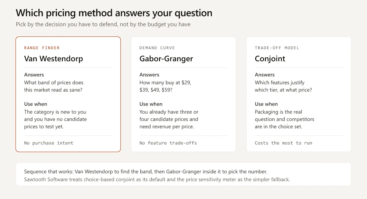
The three methods answer three different questions, and most of the disappointment with Van Westendorp comes from asking it the other two.
| Van Westendorp | Gabor-Granger | Conjoint | |
|---|---|---|---|
| Question it answers | What range reads as sane? | How many buy at each price? | Which features justify which tier? |
| Stimulus | None, open price boxes | Specific prices, accept or reject | Bundles of features and prices |
| Output | Price range, four points | Demand curve, revenue curve | Utilities, simulated share |
| Competitive frame | None | None by default | Yes, competitors in the choice set |
| Cost to run | Lowest | Low | Highest |
| Needs candidate prices first | No | Yes | Yes |
Sawtooth’s Gabor-Granger breakdown describes the mechanic: a respondent sees an initial price and gives their likelihood of purchase, which determines the next price shown, ascending or descending until the threshold is found. The output is a demand curve “plotting the percentage of respondents who are willing to purchase the product at each price point” and a revenue curve that multiplies those percentages by the prices.
Sawtooth is also direct about its own preference. The same question library entry states that the company “considers Choice-Based Conjoint and Adaptive Choice-Based Conjoint as the preferred techniques for measuring price sensitivity” and positions the price sensitivity meter as the simpler option for cases where those do not fit. That is a vendor recommending the harder method over the one on the page, which makes it worth weighting.
A decision rule you can apply in a meeting:
- If you cannot name three candidate prices, run Van Westendorp. You are looking for a range, and the other two methods need prices to test.
- If you can name three or four candidate prices and the question is which one, run Gabor-Granger inside the Van Westendorp range. Fewer price points, tighter answer.
- If the decision is which features belong in which tier, run conjoint. Neither of the other two can answer a packaging question, and packaging is usually where the money is. The good-better-best tier structure is a packaging question, and packaging is what conjoint is built for.
- If you already have customers and closed-lost data, run none of them first. Discount bands and win rates by list price are revealed behavior, and revealed beats stated every time.
The sequence that works when there is budget for two studies: Van Westendorp to find the range, Gabor-Granger inside it to pick the number. Which structural billing model you are pricing at all - per seat, usage, hybrid - is a separate decision that comes first, and the seven B2B SaaS pricing models covers the value-metric test that settles it.
How to Word the Questions for a B2B Buying Committee
The stock wording assumes one person, their own money, one unit of one thing. A B2B seat price breaks all three assumptions, and the fix is in the question stems.
| Stock consumer wording | B2B rewrite |
|---|---|
| ”so low that you feel that the quality can’t be very good" | "so low, per seat per month on an annual contract, that you would question whether the product is enterprise-ready" |
| "a bargain[,] a great buy for the money" | "a clear enough win on your current spend that you would move it forward without a business case" |
| "starting to get expensive" | "high enough that you would need to justify it to your budget owner" |
| "so expensive that you would not consider buying it" | "high enough that you would not put it forward at all this budget cycle” |
Two of the rules behind those rewrites are already in this post, applied to a different stage: state the unit inside every question stem, and screen for buying authority with the segments kept apart. Basic B2B customer segmentation governs that second one here exactly as it does targeting. Two more are specific to the wording:
- Replace “you would not buy” with the real B2B failure mode. B2B purchases rarely die at a price the buyer personally rejects; they die at a price that triggers a longer approval path than the buyer wants to walk. Question 3 should ask about the second signature. Question 4 should ask about the budget cycle.
- Put a short, specific concept description in front of the four questions. The answers you get are answers about the description, not about your product, and anything the respondent has to imagine, they will imagine cheaply.
How to Report a Van Westendorp Result
The slide that gets a pricing decision made carries five things. Most decks carry two.
- The range, stated as a range. “$33 to $56 per seat per month” is the finding. A single number pulled from the middle of it is a judgment call, and it belongs on a separate line with your name against it.
- The four points with their crossing shares. “OPP $41, where 5% of the sample would call it too cheap and 5% too expensive” tells a reader the crossing sits in a thin tail. “OPP $41” on its own hides that.
- The base. Responses collected, responses dropped, drop rate, and the reason for each drop category. There is no published norm for what a good drop rate looks like, so the percentage is not a pass mark; the reasons are what you read. Inversions concentrated in one question stem indict that stem’s wording. Inversions spread across all four indict the concept description or the price unit, and a range built on them should not be used.
- The segment definition. Who answered, what they were screened on, and whether they were budget holders or users.
- What the survey could not see, in one line: no purchase intent, no volume, no competitor in the frame. That line is what stops the range being quoted back at you two quarters later as a demand forecast.
A range presented without its base gets repeated without its base. Put the denominator in the chart title so it travels with the number.
Is the Van Westendorp Price Sensitivity Meter Still Worth Running?
Yes, for one job: bounding a price when you have no defensible reference point and no candidate prices to test. The Van Westendorp price sensitivity meter gives you a range with four labels inside it, and nothing else gets you that from four questions and a spreadsheet. The labels are weaker claims than their names imply, which is why the range travels better than any single point pulled out of it.
It is not worth running as the last study before a pricing decision, as a substitute for conjoint on a packaging question, or on a sample small enough that one respondent moves a curve. Those three misuses account for most of the method’s bad reputation, and none of them is the method’s fault.
The version I would field: six questions instead of four, with the Newton-Miller-Smith purchase-intent pair attached. Real-time validation on the price inputs. A screen for budget authority with the segments kept separate. Two hundred usable responses per segment after cleaning. The drop rate reported on the same slide as the range. Then Gabor-Granger inside the range before anyone touches the pricing page.
Put that range on one slide next to your margin floor and your closest competitor’s list price. In the meeting this post opened with, that slide is what turns Finance’s $28, Sales’ $79 and two prospects anchored on the incumbent into a shortlist instead of three opinions. Then test the shortlist with a method that asks people to accept or reject a real number.
Read the drop rate first. It tells you whether the rest of the chart is worth anything.
Frequently Asked Questions
What is the Van Westendorp price sensitivity meter?
It is a survey technique that asks four open-ended price questions, plots the answers as four cumulative curves, and reads a range of acceptable prices from where those curves cross. Peter van Westendorp presented it at the ESOMAR congress in 1976. It produces a price band, not a demand forecast.
What is price sensitivity?
Price sensitivity is how much a buyer's willingness to purchase changes when the price changes. High price sensitivity means a small increase pushes buyers away; low price sensitivity means the same increase barely registers. Price elasticity is the measured version of the same idea, expressed as a ratio of percentage change in demand to percentage change in price.
How many responses do you need for a Van Westendorp study?
Enough that one respondent does not move a curve. At 20 responses each person is worth 5 percentage points, which can shift a crossing by several dollars. I would not take a Van Westendorp result into a pricing decision below roughly 200 usable responses per segment, counted after illogical answers are removed.
What is an example of price sensitivity analysis?
Collect four price answers from each respondent, drop anyone whose answers are not in increasing order, then plot the cumulative share who call each price too cheap, cheap, expensive and too expensive. In the worked example in this article, 24 raw responses became 20 valid ones and produced an acceptable range of $33 to $56 per seat per month.
Is the Van Westendorp method accurate for B2B SaaS?
It was presented in 1976 as a psychometric measure of consumer price perception, and it measures stated price acceptability with no measure of purchase intent or volume. For B2B it needs the unit stated explicitly, a screen for budget authority, and a follow-up method such as Gabor-Granger before anyone commits to a number.