Good Better Best Pricing: How to Build the Three Tiers
Good better best pricing with the actual numbers: the feature-allocation rule, real price-gap ratios, target tier mix, and how to migrate existing customers.

Good better best pricing is a three-tier packaging structure: a stripped entry plan (Good), a mid plan built to carry most of the revenue (Better), and a premium plan holding the capabilities expensive buyers need (Best). Each tier steps up in price and in the value metric, so customers self-select instead of negotiating.
The structure is close to universal now. Monetizely’s 2025 SaaS pricing benchmark study, published in December 2025, analyzed 103 SaaS companies and found the average pricing page carries 3.2 public tiers plus a custom enterprise option. Three tiers has become the default shape of a pricing page.
The hard part is no longer deciding to use a good better best pricing strategy. The hard part is filling it: the rule for deciding which feature goes in which tier, the arithmetic for how far apart the tiers should sit, and what to do with the customers already sitting on your old plans. Those three things are the entire job, and vagueness about them is why three-tier pages leak revenue.
So this is the operator’s version. A feature-allocation rule with a scoring rubric, gap ratios computed from live pricing pages you can open right now, target tier-mix percentages, and a migration playbook for moving existing customers onto restructured tiers without churning them.
If you are still deciding between tiered, usage-based and per-seat, start with the seven B2B SaaS pricing models and come back once tiered is the answer.
What Is Good Better Best Pricing?
The model gives one product three published versions at three price points. The tiers are not three sizes of the same thing. Each one is aimed at a different buyer with a different job.
| Tier | Who it is for | Its job |
|---|---|---|
| Good | The price-sensitive buyer, or the individual evaluating alone | Get them in, get them to first value, make the next step obvious |
| Better | The team that has already decided the category is worth paying for | Carry the majority of revenue and be the default choice |
| Best | The buyer whose blocker is governance, scale or risk, not features | Hold the ceiling and absorb the expensive requirements |
Two things separate this from simply having three plans. First, the tiers are cumulative: Better contains everything in Good, Best contains everything in Better. Break that and you force buyers to compare feature grids, which is how deals stall.
Second, the middle tier is designed to win. Presenting three options changes what “reasonable” looks like, and the top tier does useful work even when very few people buy it, because it sets the ceiling the middle one gets judged against. The mechanics behind that are a longer story about anchoring and choice architecture. The packaging consequence is what matters here: Best earns its place on the page whether or not it earns much revenue.
How the Good Better Best Pricing Model Is Built
Before any feature goes anywhere, pick the value metric, the single unit that grows as the customer gets more value. Seats, tracked keywords, contacts, gigabytes, monitored sites, API calls. The three tier pricing structure is then built as three levels of that one metric, with feature access layered on top.
That order matters. Teams that start with the feature list end up with three arbitrary bundles and no reason for anyone to move between them.
| Design decision | The rule | The failure it prevents |
|---|---|---|
| Value metric | One metric, the same across all three tiers | Tiers that cannot be compared, so buyers stall |
| Tier count | Three published, plus optional bookends | Choice overload above four or five options |
| Feature access | Cumulative and additive | Buyers doing feature-grid archaeology |
| Naming | Describe the buyer or the level, never the internal roadmap (what 41 live ladders actually use) | Names nobody can self-select into |
| Enterprise | Quote-based, sits above Best | A published number that caps your biggest deals |
Look at what the published pages actually do with the metric. Semrush lists Starter at $199/mo, Pro+ at $299/mo and Advanced at $549/mo on monthly billing, alongside a narrower SEO plan at $139. The feature list adds a handful of items per step: Pro+ layers on historical data, content optimization and cannibalization analysis, Advanced adds share of voice and API access. The metric moves far harder: 5, 15 and 40 websites to monitor, and 500, 1,500 and 5,000 keywords tracked daily (Semrush pricing). Same product, three levels of the same unit.
Ahrefs runs the identical pattern with bookends attached. The three-tier spine is Lite $129, Standard $249, Advanced $449, with a $29 Starter below it and a $1,499 Enterprise plan above (Ahrefs pricing). That is what “3.2 tiers plus a custom option” looks like in practice: a three-tier spine with an entry plan or an enterprise plan bolted on.
The Feature-Allocation Rule: How to Decide Which Features Go in Each Pricing Tier
Which feature goes in which tier is where packaging debates stall for weeks. Here is a rule that resolves it without a committee.
Score every feature on three axes, 1 to 5:
- Value perception. How badly does the buyer want it, before they know what it costs you? Ask this from the buyer’s side, not the roadmap’s.
- Cost to serve. What does delivering it actually cost, counting infrastructure, support load, implementation and compliance overhead?
- Competitive differentiation. Do competitors give it away in their free plan, or is this genuinely yours?
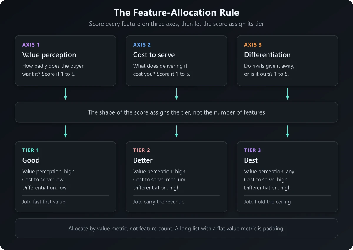
Then route by the shape of the score:
| Score signature | Goes in | Why |
|---|---|---|
| High value, low cost, low differentiation | Good | Table stakes. Cheap to give, and withholding it only makes you look mean |
| High value, medium cost, high differentiation | Better | This is the upgrade reason. It is why the middle tier is worth paying for |
| Any value, high cost, high differentiation | Best | SSO, audit logs, custom SLAs, dedicated support, advanced permissions |
| High value, high cost, low differentiation | Meter it | Do not bundle it. Price it as usage or an add-on |
| Low value, any cost, any differentiation | Cut it | Not a tier decision, a roadmap decision |
Three rules make this work in practice.
Allocate by value metric, not feature count. The temptation is to balance the bullet lists so each tier looks generous. Resist it. A tier with twenty bullets and a flat value metric is padding. The Semrush spine moves monitored sites 3x then 2.67x and tracked keywords 3x then 3.33x. That is the upgrade reason, and no bullet list is doing that work.
Never put a feature in Best that the Better buyer needs to succeed. If Better cannot deliver its own promised outcome without something you locked into Best, you have not built a premium tier, you have built a hostage situation. Churn follows.
Withhold on a dimension the buyer accepts. Volume limits, seat counts and governance features feel fair to withhold. Basic reliability, support responsiveness and data export do not. Gate the wrong dimension and you get a wave of nickel-and-diming reviews that outlast the pricing change by years.
One caveat on the free tier, if you run one: a free plan is a distribution decision, and it answers a different question from the one the Good tier answers. That question is covered in product-led growth examples.
The Gap Math: How Far Apart the Tiers Should Sit
Feature allocation decides what is in each tier. The price gap between pricing tiers decides whether anyone moves.
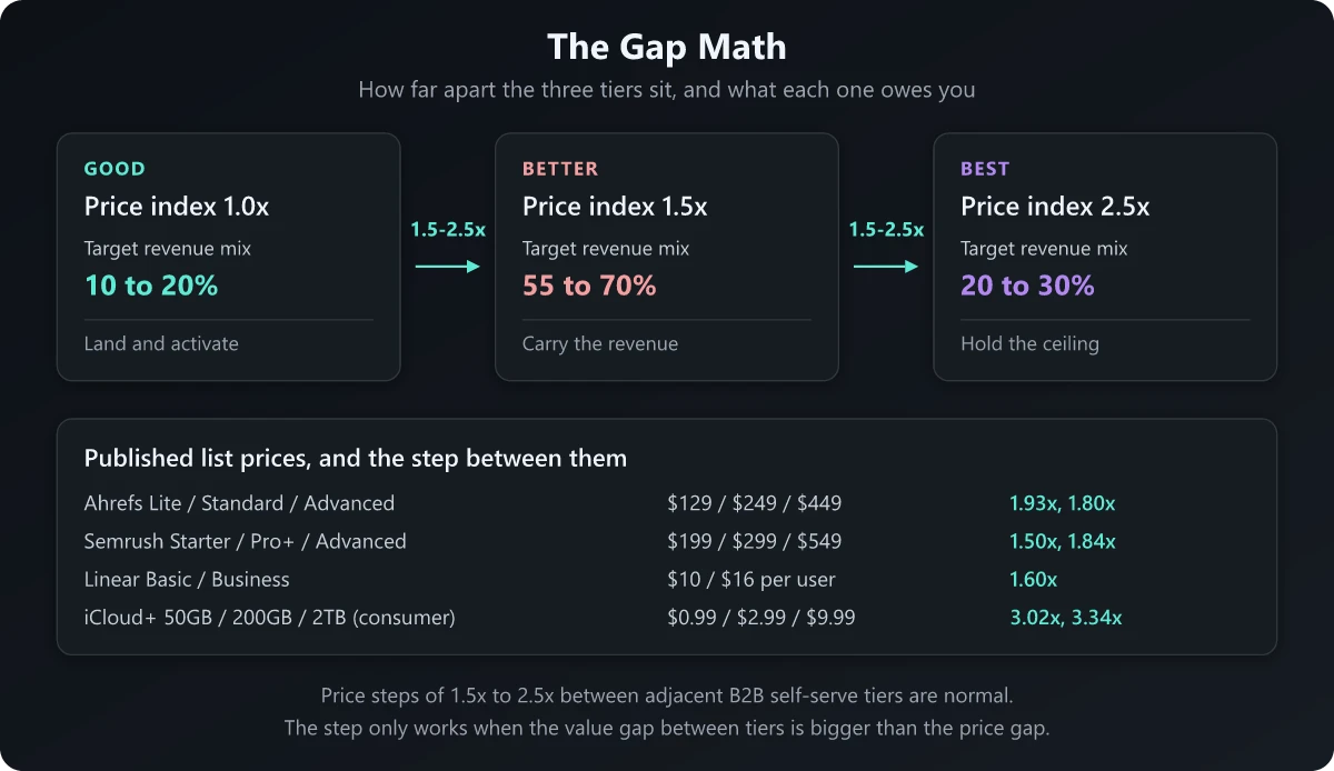
Here is what the published pages actually do. Every number below sits on the vendor’s own pricing page.
| Product | Tiers | List price | Step |
|---|---|---|---|
| Ahrefs | Lite / Standard / Advanced | $129 / $249 / $449 per month | 1.93x, then 1.80x |
| Semrush | Starter / Pro+ / Advanced | $199 / $299 / $549 per month | 1.50x, then 1.84x |
| Notion | Plus / Business | $10 / $20 per member per month | 2.00x |
| Airtable | Team / Business | $20 / $45 per user per month, billed annually | 2.25x |
| Linear | Basic / Business | $10 / $16 per user per month, billed yearly | 1.60x |
| Calendly | Standard / Teams | $10 / $16 per seat per month | 1.60x |
| HubSpot Marketing Hub | Professional / Enterprise | $800 / $3,600 per month | 4.50x |
Two patterns fall out of that table.
B2B self-serve steps cluster between 1.5x and 2.5x. Every purely self-serve pair in that table sits in the band. Below about 1.4x the upgrade is not worth the internal approval conversation. Above roughly 3x on a B2B self-serve page, the step stops being an upgrade and starts being a different purchase that needs a human.
Sales-assisted steps are much wider. The 4.5x jump from HubSpot Professional to Enterprise is not a mistake. Once a salesperson is involved, the gap is negotiating room and the list price anchors a conversation that lands somewhere else.
Now the rule that actually governs the gap: the value gap has to be bigger than the price gap. Check it against the published numbers.
- Semrush charges 1.84x more for Advanced over Pro+ and gives 2.67x the monitored sites and 3.33x the tracked keywords.
- HubSpot charges 4.5x more for Enterprise over Professional and includes 5x the marketing contacts, 2,000 against 10,000.
- Apple charges 3.34x more to move iCloud+ from 200GB to 2TB, and hands over roughly 10x the storage (iCloud+ pricing). Consumer storage sustains a step that wide because the value metric is perfectly legible: gigabytes need no explanation, so nobody has to be talked through what the jump buys.
In each case the buyer gets more of the thing they measure than the amount extra they pay. That asymmetry is what makes an upgrade feel like a step up. Invert it, charging 2x for 1.5x the value metric, and the pricing page reads as a penalty for growing, which is the fastest way to teach customers to ration their own usage.
Target Tier Mix: What Each Tier Owes You
Set the target distribution before you launch, then treat every deviation as a diagnostic. Measure revenue mix. Logo mix flatters the cheap tier and tells you almost nothing about the money.
| Tier | Target share of revenue | If it runs high | If it runs low |
|---|---|---|---|
| Good | 10-20% | Better is not differentiated enough to be worth the step | Good is too thin and you are losing the entry segment entirely |
| Better | 55-70% | Healthy. This is the design intent | The upgrade reason is unclear or the gap is too wide |
| Best | 20-30% | You are underpricing Best, or Better is missing something it needs | Best has no real buyer, only aspirational features |
Those are design targets, not benchmarks. What matters is that you decided the number in advance and can now tell whether the packaging is behaving.
Setting the levels is a separate exercise from setting the tiers, and it is worth a real study rather than a guess: the Van Westendorp price sensitivity meter is the cheapest method that produces a defensible range, provided you clean the responses properly.
The cautionary case is public. Netflix reported that its ads plan, priced at $8.99 in the US, represented over 60% of all Q1 sign-ups within its ads countries (Netflix Q1 2026 shareholder letter). A cheap entry tier will take the mix if you let it. That is fine for Netflix because a second revenue stream, advertising, rides on that tier. Most B2B products have no second stream, so a Good tier eating the mix is straightforwardly a revenue problem dressed up as an adoption win.
Good Better Best Pricing Examples
The B2B examples above share a pattern worth naming: a three-tier spine, then bookends. Ahrefs adds a $29 Starter below and a $1,499 Enterprise above. Semrush adds a narrower $139 SEO plan. HubSpot puts a per-seat Starter under a Professional and Enterprise pair. Nobody actually ships exactly three plans, and nobody ships seven either.
The consumer set is where most people first meet this structure, and it teaches the metric lesson more cleanly because the metric is so visible.
| Product | Tiers | Price | What actually changes |
|---|---|---|---|
| iCloud+ | 50GB / 200GB / 2TB | $0.99 / $2.99 / $9.99 per month | Storage: 4x, then roughly 10x |
| Spotify Premium | Individual / Duo / Family | $12.99 / $18.99 / $21.99 per month | Number of accounts, not features |
| Netflix | Ads plan upward | $8.99 in the US for the ads tier | Advertising, streams and video quality |
| Car trim levels | Base / mid / top | Manufacturer set | Equipment groups, priced as bundles |
Spotify is the purest illustration of allocating by value metric. Individual to Duo to Family barely changes the feature set at all. What changes is the number of people covered, which is the only unit a household actually measures. The tiers hold together because the metric is obvious.
One consumer convention does not carry over. Every listed price in that table ends in .99, while every B2B price in this post is a round number. A price that gets multiplied by seats and by twelve months reads as calculated, which is why B2B SaaS pricing psychology puts the cutoff at the procurement threshold.
The car analogy deserves one qualification. Trim levels work because a buyer can see and sit in the difference. Software cannot lean on that, which is why an unclear software tier fails in a way an unclear trim level does not.
How to Move Existing Customers Onto Restructured Pricing Tiers
This is the hardest part of the real job. New pricing applies to new customers on day one. Everyone already on the old packaging is a separate project with its own risk.
1. Segment before you communicate. Split the base into three groups: accounts that come out better on the new packaging, accounts that are neutral, and accounts that pay more or lose something. Those groups need three different messages on three different timelines. Sending one email to all of them is the most common way this goes wrong.
2. Decide grandfathering by economics. Monetizely’s legacy pricing migration guide offers a usable threshold: grandfather when customer lifetime value exceeds the migration revenue gain by 3x or more. Grandfather selectively at the top, migrate the rest, and put an end date on every legacy plan so it does not quietly become permanent.
3. Give real notice. The same guide recommends 90 or more days of advance notice as a minimum, and 180 days for enterprise accounts, inside a 6 to 12 month transition window. Notice is what keeps the conversation about value. Skip it and the first a customer hears of the change is at renewal, which is a different conversation entirely.
4. Move people at their renewal. Renewal is the moment the customer is already evaluating the relationship. A migration that lands mid-term, on a company-wide cutover date, reads as a unilateral change. The same migration landing at renewal reads as a normal decision.
5. Set the migration targets in advance. The same guide’s benchmarks are a reasonable starting point: target 85% or more voluntary migration before sunset, and plan for 1-3% incremental churn. Deciding the acceptable churn number before launch is what stops a panicked reversal in week three when the first cancellation email lands.
The communication matters as much as the packaging. The structure that works, which is to lead with what changes, give the date, explain the value and name the escape hatch, is the same one in the price increase announcement playbook, and it applies to a repackaging even when the headline price has not moved.
One rule overrides all five: never let a migration remove a capability the customer is actively using. If the new Better tier lacks something a legacy account depends on, either grandfather that capability for that account or hold the migration. A customer who loses working functionality reads the pricing email as a betrayal.
The Four Tells That Your Good-Better-Best Pricing Has Stopped Working
Packaging decays quietly. These four signals mean the tiers no longer match the market.
1. The middle tier is not winning. If Better is not the most-chosen paid plan by revenue, either the upgrade reason is invisible on the page or the gap is too wide to clear.
2. Sales is discounting Best down to Better money. That is the market telling you the top tier is priced above its perceived value, or that the features justifying it are the wrong ones. Track average discount by tier. The tier with the biggest discount is the tier that is wrong.
3. The same feature request keeps arriving from every tier. When Good, Better and Best buyers all ask for the same thing, that capability is mis-allocated. It either belongs lower than you put it, or it should be metered separately.
4. New buyer types keep landing outside the ladder. A segment that needs a combination none of the three tiers offers stops being an edge case once it repeats. It is either a fourth tier, an add-on, or a signal that the value metric has drifted from how the product is now used.
Any one of these is a repackaging trigger. Two at once means the current tiers were designed for a market you no longer sell to, which is the moment to re-check the underlying pricing strategy before shuffling features between boxes.
The Good-Better-Best Tier Design Worksheet
One page, three parts. Copy it into a sheet and run your feature list through it.
Part 1: score every feature. One row per capability, each axis scored 1 to 5.
Feature                     | Value | Cost | Diff | Tier
----------------------------|-------|------|------|----------
CSV export                  |   4   |  1   |  1   | Good
Team workspaces             |   5   |  3   |  4   | Better
SSO and audit logs          |   3   |  5   |  4   | Best
Extra API volume            |   5   |  5   |  2   | Meter it
Legacy integration          |   1   |  3   |  1   | Cut it
Routing rules, applied in order:
- Value 4-5, cost 1-2, differentiation 1-2 goes to Good
- Value 4-5, cost 3, differentiation 4-5 goes to Better
- Cost 4-5 with differentiation 4-5 goes to Best
- Value 4-5 with cost 4-5 and differentiation 1-2 gets metered as usage or an add-on
- Value 1-2 on anything is a roadmap decision
Part 2: set the gaps. Fill in your own numbers, then run the four checks.
Good   price: ______   index 1.00x   value metric level: ______
Better price: ______   index ____x   value metric level: ______
Best   price: ______   index ____x   value metric level: ______

Check 1: Good to Better sits between 1.5x and 2.5x           [ ]
Check 2: Better to Best sits between 1.5x and 2.5x           [ ]
Check 3: value metric multiple beats price multiple, each step [ ]
Check 4: every tier is cumulative, no feature is removed      [ ]
Part 3: set the tier mix and the review date. Write down the target revenue mix, using 10-20% / 55-70% / 20-30% as the starting point, the date you will first measure it, and the churn number you will accept during any migration. Numbers decided in advance are the difference between a pricing decision and a pricing argument.
For the wider reporting context on what to watch after launch, product marketing metrics covers how tier performance ties back to revenue.
Where to Start
A good better best pricing strategy is easy to describe and genuinely hard to execute. The definition takes fifty words. The work sits in three things: which feature goes where, how far apart the prices sit, and what happens to the customers already on the old plans.
Run it in that order. Pick the value metric first, then score every feature on value perception, cost to serve and differentiation, and let the shape of the score assign the tier. Set the gaps at 1.5x to 2.5x between adjacent self-serve tiers, and confirm the value multiple beats the price multiple at every step. Write down the target revenue mix before launch so you can tell later whether the packaging worked. Then plan the migration as its own project, with its own notice period, its own grandfathering rule and its own accepted churn number.
Do those four things and the three tiers stop being a layout choice on a web page. They become the mechanism that decides how much of the value you create you actually get to keep.
Frequently Asked Questions
What percentage of customers should land in each tier?
Track revenue mix, since logo mix flatters the cheap tier and says little about the money. A workable design target is roughly 10-20% of revenue in Good, 55-70% in Better and 20-30% in Best. If Good is taking more than a third of revenue, the middle tier is not differentiated enough to justify the step up.
What is the ideal price difference between good, better, and best tiers?
In published SaaS pricing, adjacent tiers usually sit 1.5x to 2.5x apart. Ahrefs steps 1.93x then 1.80x across $129, $249 and $449. The ratio matters less than the rule behind it: the value gap between two tiers has to be bigger than the price gap.
When does good-better-best pricing stop working?
When the tiers stop mapping to different jobs. The four tells are a middle tier that is not winning on revenue, sales discounting Best down to Better money, the same feature request arriving from every tier at once, and new buyer types that keep landing outside the ladder.
Does the .99 trick actually work?
It depends on the buyer. Consumer subscriptions lean on it heavily, with Apple pricing iCloud+ at $0.99, $2.99 and $9.99, while B2B SaaS list prices are almost all round numbers. Charm pricing signals a bargain, and signaling a bargain is rarely what you want in a considered B2B purchase. The full rule, charm pricing below the procurement threshold and round numbers above it, is worked through in the B2B SaaS pricing psychology guide.
What are the three C's of pricing?
Cost, customer and competition: what delivery costs you, what the customer is willing to pay, and what the alternatives charge. Good-better-best is a packaging decision layered on top of those three inputs.