How to Build a Win-Loss Analysis Dashboard (2026)
How to build a win-loss analysis dashboard sales and product actually use - the metrics, panels, and data flow that turn deal outcomes into decisions.

Every win-loss program I have inherited came with the same artifact instead of a real win-loss analysis dashboard: a beautiful 40-slide deck, presented once at a QBR, then never reopened. Someone interviewed a dozen lost deals, color-coded the themes, and built a story. The room nodded.
Three weeks later a rep asked why we keep losing to the same competitor, and nobody could pull the answer without redoing the whole exercise. That is the failure mode a win-loss analysis dashboard exists to kill.
The payoff for getting this right is not subtle. According to Clozd’s 2025 State of Win-Loss Analysis Report, 63% of companies with win-loss programs saw increased win rates.
The programs that hit that number are not the ones with the prettiest decks. They are the ones whose insights stay in front of sales, product, and marketing every week instead of dying in a slide.
A dashboard is what makes that difference. It turns interviews and CRM records into a living instrument that three teams open, filter, and act on. This post walks through how to build a win-loss dashboard end to end: the inputs that feed it, the panels that answer real questions, the design principles that keep it trustworthy, and how to route what it shows into roadmap, battlecards, and enablement.
Why a Win-Loss Analysis Dashboard Beats a Deck
A deck is a snapshot of one person’s interpretation at one moment. A win-loss dashboard is a system of record that anyone can interrogate on their own schedule. That shift changes who trusts the insight and how fast it converts into a decision.
The deck fails for structural reasons, not effort reasons. It ages the instant it is finished, it hides the underlying deals behind summarized themes, and it forces every new question back through the analyst who built it. When a VP of Sales asks whether the pricing objection is worse in enterprise than mid-market, the deck cannot answer without a rebuild.
A dashboard flips all three. It refreshes on a cadence, it lets a skeptic drill from a headline number down to the specific deal that produced it, and it answers follow-up questions without a human in the loop. If you are still deciding whether a formal program is worth the effort, my primer on what win-loss analysis actually is covers the case before you build the reporting layer.
The mental model I use: the deck is the argument, the dashboard is the evidence room. You still need a human to tell the story at the QBR, but the story has to point at a live source anyone can verify, or it decays into folklore by the next quarter.
The Inputs: What Feeds a Win-Loss Analysis Dashboard
A dashboard is only as honest as what flows into it. Before you touch a single chart, you need to lock down five input streams, because a dashboard built on messy fields will confidently display the wrong story. Garbage in, dashboard out.
CRM closed-won and closed-lost data
This is the spine. Every opportunity that reached a terminal stage, with its outcome, deal size, close date, sales stage at loss, and owner. Without clean closed-won and closed-lost records, you cannot compute a win rate at all, let alone slice it.
The common trap is deals that stall and get marked closed-lost months late, or nudged to a future quarter to protect a forecast. Those distort every trend line. Agree on what a real loss is and when it gets logged before you trust the numbers.
Structured loss reasons
Free-text loss notes are where insight goes to die. You need a constrained picklist: price, missing feature, lost to competitor, no decision, timing, wrong fit. A rep picks from a short list, and only then can you count reasons across hundreds of deals.
Keep the list short enough that reps actually use it, around six to eight primary reasons with an optional detail field. A picklist with thirty options gets ignored, and an ignored field is worse than no field because it looks like data.
Win-loss interview themes
The CRM tells you what was recorded. Interviews tell you what actually happened.
Structured buyer interviews surface the reasons behind the reasons, the things a rep either never heard or would rather not log. This is where a real voice of the customer practice feeds the dashboard, because a coded interview theme is a field you can chart just like a CRM value.
Tag each interview with a consistent theme taxonomy so it maps back onto the dashboard. If the CRM loss reason says price but interviews reveal it was really a missing integration that made the price feel high, that gap is one of the most valuable things the dashboard can expose.
Competitor tags
Every competitive deal needs a field for which competitor was in the room and who won it. This one field powers the entire competitive view: win rate against each rival, which competitor is rising, and where you are getting displaced.
Standardize the competitor names ruthlessly. Salesforce, SFDC, and sfdc.com logged as three separate values will fracture your competitor panel into nonsense.
Segment and firmographic fields
Finally, the dimensions you filter by: segment, region, industry, deal size band, product line, lead source. These are what let a single dashboard answer a hundred different questions instead of one. A win rate you can split by segment and competitor is where decisions live.
The Core Panels Every Win-Loss Dashboard Needs
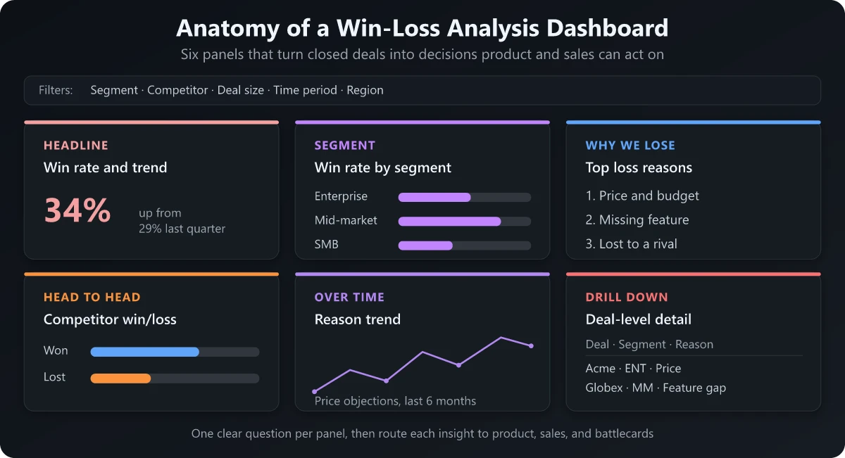
With inputs in place, the build is really a question of which panels to include and what decision each one drives. The discipline here is one primary question per panel. If a chart is trying to answer three things, it answers none of them well.
Headline win rate and trend
The top-left panel, always. A single win-rate number for the selected period and a trend line showing its direction over the last several quarters. This is the number leadership checks first, so it sets the frame for everything below it.
Decide the denominator before you build the panel, and write it on the dashboard. The same quarter of deals produces wildly different rates depending on whether you count all opportunities, only qualified ones, or exclude no-decision losses, which is also why published SaaS win rate benchmarks are mostly not comparable to yours.
Win rate by segment, competitor, and deal size
The workhorse panel. A set of bar charts breaking the headline rate down by the dimensions you captured: which segment converts best, which competitor you beat or lose to, whether large deals close at a different rate than small ones.
This is where patterns jump out. Say your overall win rate is 40%, but it is 60% in mid-market and 22% in enterprise. That is not a win-rate problem, it is a segmentation story, and it points you straight to the high-converting segments worth prioritizing in your ABM program.
Top loss reasons
A ranked bar chart of why deals died, straight from the structured picklist. Ordered by frequency, filterable by segment and competitor, so why we lose changes shape depending on who you are losing to.
The value is in the filtering. Your top loss reason overall might be price, but filtered to a specific competitor it might flip to missing feature. Same data, completely different action.
Competitor win and loss splits
A dedicated competitive panel showing your head-to-head record against each named rival: total competitive deals, win rate against each, and the direction of travel. This is the view your competitive intelligence work lives or dies on.
Pair it with the loss reasons filtered by competitor and you have the raw material for a battlecard: which rival is worth the effort, and what to say once you decide.
Reason-over-time
A trend view of loss reasons across quarters. This is the panel that catches emerging threats early. A competitor climbing from, say, 5% of your losses to 20% over three quarters is a signal you want months before it shows up in the headline number.
Static charts tell you today’s state; the over-time view tells you the trajectory, which is what informs where product and marketing invest next.
Deal-level drill-down
The trust panel. Any number on the dashboard should be clickable down to the specific deals behind it, with a link into the CRM record and any interview notes. When a skeptical AE says the competitor number is wrong, you click through to the exact deals and settle it.
Without that, a dashboard is just prettier PowerPoint. Going from a summary bar to the raw opportunity in two clicks is what earns credibility.
Panels, metrics, and the decision each one drives
Here is the whole build in one view. When someone asks where to start, I point at this table and ask which decision they most need to make this quarter.
| Panel | Primary question it answers | Key metric | Decision it drives |
|---|---|---|---|
| Headline win rate and trend | Are we winning more or less over time? | Win rate, quarter-over-quarter delta | Whether to sound the alarm or stay the course |
| Win rate by segment and deal size | Where do we win and where do we struggle? | Win rate split by dimension | Where to focus sales coverage and spend |
| Top loss reasons | Why are we losing deals? | Loss count by reason | What to fix in product, pricing, or messaging |
| Competitor win and loss splits | Who beats us and who do we beat? | Head-to-head win rate | Which competitor to build a battlecard against |
| Reason-over-time | What threat is emerging? | Reason share by quarter | Where to invest before it becomes a crisis |
| Deal-level drill-down | Which exact deals sit behind this number? | Opportunity list with links | Whether to trust the number and act on it |
If a panel does not map to a decision, cut it. Dashboards fail from clutter far more often than from missing charts.
Design Principles That Keep a Win-Loss Analysis Dashboard Alive
Building the panels is the easy part. Keeping the dashboard trusted and used is the part that actually determines whether your program joins the 63% or dies like the deck. Four principles do most of that work.
One primary question per panel
Each panel should have a single job you can state in one sentence. When stakeholders ask to cram three metrics into one chart, the honest answer is usually a second panel, not a busier one.
Filters and drill-through everywhere
A dashboard without global filters is a poster. Segment, competitor, date range, and deal size should filter the entire page at once, and every summary number should drill through to the deals beneath it. The whole advantage over a deck is interactivity, so do not ship a static one.
A refresh cadence people can rely on
Decide how often the data updates and publish it on the dashboard itself: nightly CRM sync, interview themes added weekly, a formal review monthly or quarterly. When people know the schedule, they trust the numbers. When they suspect the data is stale, they quietly go back to asking the analyst, and you are back to the deck.
One source of truth
The dashboard has to be the single place these numbers live. The moment sales keeps its own win-rate spreadsheet and product keeps another, the program fractures and every meeting argues about whose number is right. Pick the platform, whether that is your BI tool, your CRM’s native reporting, or a dedicated win-loss platform, and make it the only version anyone cites.
Most teams can build this with the three or four tools they already own: the CRM for outcomes, a BI layer like Looker, Power BI, or Tableau for the panels, and a lightweight interview repository. You rarely need to buy something new; you need to standardize the fields you already have.
Turning the Dashboard Into Action
A win-loss dashboard that nobody acts on is a very expensive screensaver. The build is only half the job. The other half is wiring each panel to a team and a ritual so the insight has somewhere to go.
Route product signals to the roadmap
The top loss reasons panel, filtered to missing feature, is a prioritized backlog written by your lost deals. Take it to roadmap reviews on a cadence, ranked by lost revenue rather than raw count. A gap tied to real lost pipeline argues for itself.
Feed competitive splits into battlecards
The competitor panels are the raw material for enablement. When a rival’s win rate against you climbs, that is the trigger to build or refresh a card.
Pairing the head-to-head split with the loss reasons filtered to that competitor gives you exactly what belongs on a competitive battlecard: where you lose to them, why, and the counter. The dashboard tells you which card to build; the card tells the rep what to say.
Close the loop with enablement
Insight that does not change rep behavior is trivia. The dashboard should feed your enablement rhythm: recurring loss reasons become objection-handling modules, winning patterns become talk tracks, and the trend panels tell you whether it is working. That last part matters, because tying win-rate movement back to enablement is exactly the connection your sales enablement KPIs should be built to prove.
The pattern across all three is the same: a panel, an owner, and a recurring meeting where the panel is the agenda. Standing review slots on three teams’ calendars are what turn win-loss from a report into an operating habit.
Conclusion: Build the Win-Loss Analysis Dashboard, Then Feed It
The reason most win-loss efforts stall is that they end at the deck, the one artifact designed to be watched once and forgotten. A win-loss analysis dashboard is the fix, because it keeps the evidence live, interrogable, and in front of the people who make the calls.
That is the real mechanism behind the 63% of programs that lift their win rates. Not more interviews, but insight that stays visible long enough to act on.
Do not try to build all seven panels this week. Start with the two inputs you can trust today, closed-won and closed-lost records plus a structured loss-reason picklist, and stand up two panels: headline win rate with its trend, and top loss reasons. That alone beats any deck, because anyone can open it and drill in.
Then feed it deliberately. Add interview themes, standardize your competitor tags, wire each panel to a team and a recurring meeting, and publish the refresh cadence so people trust it. The teams that win with win-loss are not the ones with the longest report.
They are the ones whose win-loss analysis dashboard is open on a second monitor while product plans the roadmap and a rep preps for the call. Pick your two panels, ship them this week, and let the evidence room replace the deck.
Frequently Asked Questions
What is a win-loss analysis dashboard?
A win-loss analysis dashboard is a live report that combines CRM closed-won and closed-lost data with structured loss reasons and interview themes so sales, product, and marketing can see win rates, top loss reasons, and competitor splits in one place. It replaces the static slide deck with something teams can filter and drill into on their own.
What metrics should a win-loss dashboard include?
At minimum it should show a headline win rate with a trend line, win rate split by segment and deal size, top loss reasons, and head-to-head win rates against each competitor. Every summary metric should drill down to the specific deals behind it so the numbers stay trustworthy.
What tools do you need to build a win-loss dashboard?
Most teams build it with tools they already own: the CRM for closed-won and closed-lost outcomes, a BI layer like Power BI, Looker, or Tableau for the panels, and a simple repository for coded interview themes. You rarely need to buy dedicated software to get started.
How often should a win-loss dashboard be refreshed?
Sync CRM outcomes at least nightly, add interview themes weekly as they come in, and hold a formal review monthly or quarterly. Publishing the refresh cadence on the dashboard itself is what keeps people trusting the numbers instead of reverting to their own spreadsheets.
How is a win-loss dashboard different from a win-loss report?
A report is a static snapshot someone interprets once and presents, while a dashboard is a live instrument anyone can filter and drill into on their own schedule. The dashboard stays useful long after the report would have been forgotten in a drawer.