How to Measure SaaS Content Marketing: A 4-Layer Model
How to measure SaaS content marketing when the buying cycle runs ten months: a four-layer model, a holdout test, and the metrics worth deleting outright.

Content marketing cannot really be measured. Anyone working out how to measure SaaS content marketing meets that objection sooner or later, usually from a CFO, and the honest version of it is stronger than most content marketers admit out loud. Here it is at full strength.
A SaaS buyer reads your comparison page in March and forgets where they read it. A colleague drops a link in Slack in June. In September the buyer types your brand name into Google, lands on the pricing page, books a demo, and your CRM writes “organic search” into the lead source field.
Six other people in that buying group touched your content and never identified themselves at all. The comparison page did the work, the branded search took the credit, and nothing in the analytics stack ever saw the causal step.
The conclusion most people draw from that story is wrong, though. The story proves that a single exact per-asset revenue number is not recoverable. It does not prove that content performance is unknowable. Those are two different claims, and collapsing them is why so many content teams end up reporting sessions to a board that asked about pipeline.
The gap between what buyers say influenced them and what tracking records is itself measurable. HockeyStack’s 2024 self-reported attribution report collected 8,528 answers from high-intent prospects who had just booked a demo, then compared what they said against the last touch its own software had recorded on four channels. On search, the largest of the four, the two agreed 53% of the time. HockeyStack’s summary of the exercise: “the majority of prospects’ last touch and self-reported attribution did not overlap”.
So the answer to the objection is a model that reports four different kinds of evidence and stays explicit about which kind each number is. This is the model I would use to measure SaaS content marketing, the reporting line it produces, and the metrics I would delete from your dashboard this week.
Why SaaS Content Marketing Looks Unmeasurable
SaaS buying breaks the standard measurement setup in ways no tool purchase fixes. These are not analytics bugs.
The cycle outlives the tracking window. 6sense’s 2025 B2B Buyer Experience Report, released 12 November 2025 and built on more than 4,000 buyer responses, found average buying cycles running about 10 months in 2025, down from about 11 months in 2024. Google Analytics 4 gives you a 90-day default lookback for most key events, with 30 and 60 days as the alternatives, per the key event lookback window documentation. A ten-month journey measured through a three-month window loses most of its early evidence by design.
The influential part of the journey happens without a seller. The same 6sense study describes the split between independent research and seller engagement moving from 70/30 to 60/40. Content does its work during the research majority, where there is no rep to log an activity, no meeting to date-stamp, and often no form fill.
The buying group is mostly anonymous. One person books the demo. The rest read, forward, screenshot into a Slack thread, and appear in your data as unattributed sessions or as nothing at all.
Those three facts explain a finding in the Content Marketing Institute and MarketingProfs 2026 B2B research. Fielded 24 June to 14 August 2025 across 1,015 B2B marketers, it recorded measuring content effectiveness as a top-three challenge for 33% of them, with only 12% rating their own work highly effective over the previous twelve months. A third of a profession does not fail at arithmetic. The measurement problem is structural.
How to Measure SaaS Content Marketing: The Four-Layer Model
The fix is to stop asking one question of the data. “Did content work?” bundles four separate questions, and each one carries a different evidence standard, a different time lag, and a different audience.
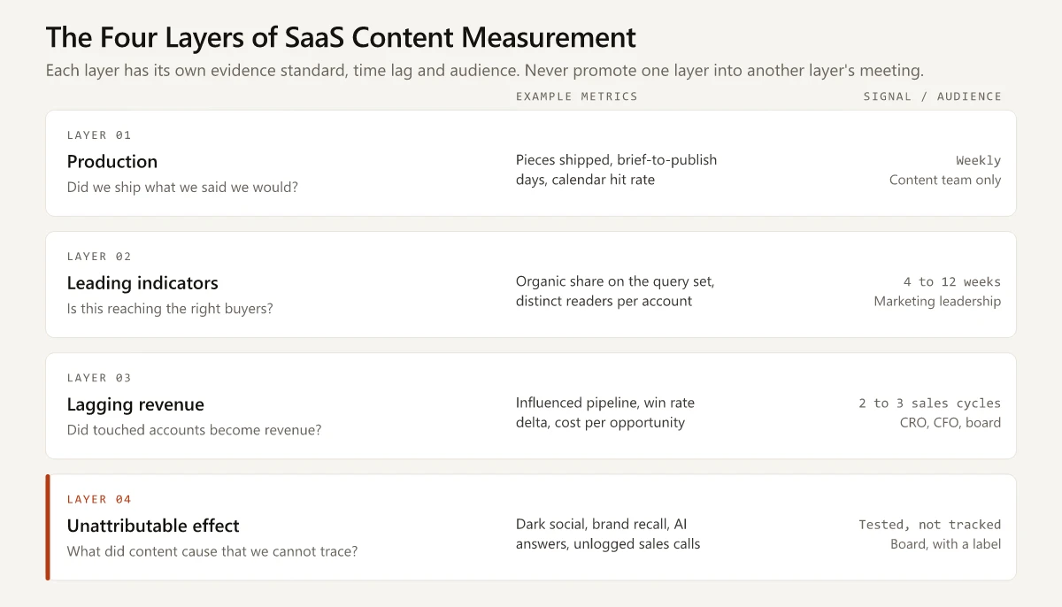
Ahrefs published a version of the first half of this split in March 2023, dividing content marketing KPIs into inputs and outputs: quantity, proportion and distribution power on one side, organic share of voice, traffic, leads, engagement, product usage, feedback and backlinks on the other. The model below extends that idea downstream, because in SaaS the outputs themselves separate into things that move this quarter, things that move after a sales cycle, and things that never resolve into a number at all.
Organic share of voice sits in that list without a definition attached, which is where it usually goes wrong. It is a lagging brand measure with a contested denominator, not a content output you can read weekly, and the difference matters when you put it next to market share on the same chart. I separate the two in share of voice vs market share, and the share of voice calculator does the computation.
| Layer | What it answers | Time to signal | Who should see it |
|---|---|---|---|
| 1. Production | Did we ship what we said we would? | Weekly | The content team only |
| 2. Leading | Is this content reaching and holding the right buyers? | 4 to 12 weeks | Marketing leadership |
| 3. Lagging | Did content-touched accounts become revenue? | 2 to 3 sales cycles | CRO, CFO, board |
| 4. Unattributable | What did content cause that we cannot trace? | Tested, not tracked | Board, with the estimate labeled |
The discipline lives in refusing to promote a layer-1 number into a layer-3 conversation, which is what happens every time a content lead opens a QBR with a traffic chart.
Each layer also has a natural home in a stack you probably already pay for, which matters because the most common reason a measurement plan dies is that nobody owned the query.
| Layer | Where the data lives | Who owns the number |
|---|---|---|
| 1. Production | The editorial calendar or project tool | Content lead |
| 2. Leading | Search Console and a rank tracker, an account-identification tool, the CRM activity log | Content lead with marketing ops |
| 3. Lagging | The CRM opportunity object, joined to contact-level web activity | Marketing ops or revenue ops |
| 4. Unattributable | A self-reported field on the form, plus a manual citation log | Content lead, reported quarterly |
Nothing on that list requires a multi-touch attribution platform. A platform makes layer 3 faster to query and it does not change what layer 4 can see, which is where most of the argument about content value actually happens.
Layer 1: Production Metrics You Report and Never Present
Layer 1 counts what your team made and where it went. Published pieces, refreshed pieces, days from brief to publish, share of the editorial calendar that shipped on time, distribution touches per asset.
These numbers manage the function. They keep a team honest about throughput, and they expose bottlenecks in review cycles that writing speed alone never explains.
They belong in a weekly team doc. They do not belong in a board deck, because a board reading “we published 14 posts” learns nothing about whether the 14 posts were worth their cost. Publishing volume is an input you control completely, which is exactly why it proves nothing.
Layer 2: Leading Indicators That Move Inside a Quarter
Layer 2 is where content measurement earns its budget between revenue reports. The test for a leading indicator: it has to move within a quarter, and a change in it has to plausibly precede a change in pipeline.
- Organic share on the buying queries you have defined. Take the 40 to 120 queries your ICP actually searches during evaluation, track your positions and estimated share against named competitors, and report movement on that fixed set. A monthly SEO report built on a defined query set answers a strategy question; one built on total sessions answers nothing.
- Depth of engagement by account rather than by session. In a reverse-IP or account-identification tool, the number that predicts pipeline is how many distinct people from one company read you in a 30-day window. Three people from the same domain reading three different pages is a buying group forming.
- Self-reported attribution captured at the demo form. One open text field: how did you first hear about us. It is the only instrument that reaches the touches your tracking missed, and the HockeyStack overlap figures above are the argument for adding it.
- Sales usage in live deals. How many open opportunities have a content asset attached, sent or referenced in the last 30 days. Content reps refuse to use is content that never reaches buyers through the channel that closes deals.
- Assisted trial or signup starts. In a product-led motion, the count of signups whose account shows any prior content session, at any point in the recorded history, before the signup event.
Only the self-reported field needs anything new, and what it needs is a form change and a CRM picklist. That makes it the cheapest measurement upgrade in B2B content and roughly an afternoon of work.
Building the query set is the part people skip, and it decides whether layer 2 means anything. Pull the queries from somewhere other than a keyword tool:
- The searches that already send you demo requests, read off Search Console.
- The phrases buyers use in your last 20 discovery call recordings.
- The comparison and alternatives terms for every competitor in your battlecards.
- The questions your support team answers most often for prospects.
Cap the list somewhere between 40 and 120 so it stays reviewable, date it, and change it once a year at most. A query set that gets edited every month is a way of always looking like you are winning.
Layer 3: Lagging Revenue Indicators
Layer 3 is the layer finance recognizes. It runs one to three sales cycles behind the content that produced it, which in a ten-month cycle means content published this quarter reports its revenue next year.
| Metric | Definition | Why it survives scrutiny |
|---|---|---|
| Content-influenced pipeline | Open opportunity value where any contact on the account touched a content page before opportunity creation | Counts the account, not the click |
| Content-influenced closed-won | The same rule, applied at close | The number a CFO will actually discuss |
| Influenced win rate delta | Win rate of content-touched opportunities minus win rate of untouched ones | A comparison, so it answers the “they would have bought anyway” objection |
| Cost per influenced opportunity | Fully loaded content cost divided by influenced opportunity count | Makes the content budget comparable to paid media |
| Payback period on an evergreen asset | Months until cumulative influenced pipeline exceeds production cost | The honest way to argue for a piece that took six weeks to make |
Lead with the influenced win rate delta. A total influenced pipeline number invites the reply that those deals were closing anyway. A delta between touched and untouched accounts puts an actual comparison on the table, and it is the closest thing to an experiment you can build out of observational CRM data.
Pair the layer-3 view with the product marketing metrics your team already reports, because the same opportunity records feed both, and a content number that contradicts the PMM number in the same meeting costs you the room.
Layer 4: The Effects You Cannot Attribute
Layer 4 is the part measurement plans leave out, and leaving it out is how content teams lose budget arguments to paid media teams whose numbers are less true but better presented.
Some of what content does leaves no trace your stack can read.
| Mechanism | What your analytics records | Best available proxy |
|---|---|---|
| Dark social: a link forwarded in Slack, WhatsApp or a private community | Direct traffic, or a session with no referrer | Self-reported source, plus direct-traffic trend on non-homepage URLs |
| Brand recall that becomes a branded search months later | Organic search, branded query | Branded search volume trend against content publish volume |
| An AI assistant summarizing your page so the buyer never visits | Nothing, or a rare referral | Citation checks on your query set, plus assistant names in the self-reported field |
| A rep paraphrasing your positioning page on a call | No activity record at all | Sales asset usage survey, once a quarter |
| A reader who leaves your ICP and returns as a buyer at a new employer | A new anonymous visitor, years later | Self-reported source mentioning a previous company |
That third row is growing. Work on brand visibility in AI search engines gets consumed at a rate your referral report understates by design, because a good answer inside a chat window removes the reason to click.
Do not report layer 4 as a number you cannot defend. Report it as a named list of mechanisms plus one estimate from the only instrument that reaches it: the self-reported attribution field, compared against tracked source. The distance between those two datasets is your best available estimate of how large layer 4 is, and it is a distance you can quantify every quarter.
B2B Content Marketing Metrics, Scored by What They Change
A metric earns dashboard space when a plausible change in it would change a decision. Score every candidate on that one test. The B2B content marketing metrics below are scored the way I would score them for a mid-market SaaS team running a sales-assisted motion.
| Metric | Layer | Changes a decision? | Verdict |
|---|---|---|---|
| Content-influenced closed-won revenue | 3 | Budget size for next year | Keep, report quarterly |
| Influenced win rate delta | 3 | Which topics to fund | Keep, report quarterly |
| Self-reported attribution mix | 2 and 4 | Channel investment | Keep, report monthly |
| Organic share on the defined query set | 2 | Which clusters to build or refresh | Keep, report monthly |
| Distinct readers per target account | 2 | Which accounts sales should call | Keep, feed to sales weekly |
| Sales asset usage in open deals | 2 | Which enablement content to fix | Keep, report monthly |
| Assisted signup or trial starts | 2 | Product-led content priorities | Keep in PLG motions |
| Total organic sessions | 1 | Rarely anything | Diagnostic only |
| Average time on page | 1 | Almost nothing | Delete |
| Bounce rate on the blog | 1 | Nothing | Delete |
| Social shares and likes | 1 | Nothing | Delete |
| Keyword rankings outside the defined set | 1 | Nothing | Delete |
| MQLs from gated content | 2 | Misleads more than it informs | Replace |
The MQL row deserves its own sentence. Gated-content MQL counts reward putting a form in front of a PDF, which suppresses reach and buys you a list of people who wanted the PDF. Swapping MQL volume for account-level engagement is the same move that separates modern SaaS demand generation from lead-volume reporting, and content measurement should follow it rather than lag two years behind.
Why Last-Touch Attribution Misreports Which Content Works
Last touch does more than under-report content. It ranks the wrong content first, and a wrong ranking sends next quarter’s budget to the wrong place.
The mechanism is a property of the model rather than a finding about your data. Last touch credits the final session by construction, so whatever page sits closest to the form absorbs the credit for the deal. The top-of-funnel article that put your brand in the buyer’s head six months earlier scores zero, however many people it reached.
Run that ranking for four quarters and you get a content program made entirely of comparison and alternatives pages, no demand creation at all, and a slow decline in the branded search volume the whole system was living on.
The tooling has moved, though not far enough. Google Analytics 4 now offers three attribution models: data-driven attribution, paid and organic last click, and Google paid channels last click. First click, linear, time decay and position-based were removed in November 2023.
Data-driven attribution improves on last click, and it still only distributes credit among touches Google observed, on identities it could stitch together, inside a lookback window that maxes out at 90 days.
Attribution is one of three methods that answer different questions, and they disagree by design rather than by error. Marketing mix modeling vs attribution vs incrementality sets out which one to believe when they conflict, and what each costs to run.
The strongest evidence that click-based measurement overstates whatever it can see comes from an experiment rather than a model. Tom Blake, Chris Nosko and Steven Tadelis ran large-scale field experiments at eBay, published as an NBER working paper in 2014 and in Econometrica in 2015, switching paid search off in some markets while leaving it on in others.
Their finding: “returns from paid search are a fraction of conventional non-experimental estimates”, and brand-keyword ads showed “no measurable short-term benefits”. The channel that looked most efficient in the attribution report was buying clicks from people who were already coming.
That was a consumer marketplace buying paid search, not a B2B company publishing content. The lesson transfers anyway, because the failure sits in the measurement rather than in the channel. Any measurement that observes only the last visible touch will overvalue whatever sits closest to the conversion and undervalue whatever created the intent. That is a description of your blog.
The size of the gap varies by channel, which is worth knowing before you decide how much weight to put on any tracked source. HockeyStack published overlap figures for four channels.
The four bases below sum to 6,403 against the 8,528 responses collected in total, and the report does not reconcile those bases against the channel-level response counts it gives elsewhere. Read each row as the overlap it is labeled, not as a rate with a known denominator.
| Channel | Overlap between self-reported and tracked last touch |
|---|---|
| Social | 60% (779 of 1,287) |
| Search | 53% (2,646 of 4,939) |
| 21% (20 of 97) | |
| Display | 2.5% (2 of 80) |
Read the bottom two rows as a warning about confidence rather than a verdict on the channels. Email and display generate few self-reported mentions in absolute terms, so the small denominators carry noise.
The top two rows carry the real weight: on the channels that drive most B2B content discovery, buyer memory and tracked source agree roughly half the time. Any dashboard presenting a tracked-source split as fact is presenting a coin flip as a measurement.
The channels the report never compared are the ones tracking cannot represent at all, among them the 1,544 answers that said word of mouth and the 684 that said only “online”.
How to Define the Influenced-Account Rule
Every number in layer 3 rests on one definition your team writes down once and stops arguing about. What each candidate rule does to the figure you end up presenting:
| Rule | Definition | Effect on the number | When to use it |
|---|---|---|---|
| Any touch, any time | Any contact on the account viewed any content page at any point before opportunity creation | Largest number, weakest claim | Early programs with thin data |
| Touch inside the cycle | Any contact viewed content within one sales-cycle length before opportunity creation | Moderate and defensible | The default for mid-market SaaS |
| Multi-touch threshold | Two or more distinct people, or three or more sessions, from the account before opportunity creation | Smallest number, strongest claim | Enterprise deals with large buying groups |
I would run the middle rule as the headline and the third as the stress test. Reporting both is what lets you say the sentence in the board paragraph below without hedging, because you already know how far the number moves when the rule tightens.
The operational work is smaller than it sounds:
- Store a first content touch timestamp on the contact record rather than reading it from session data at query time.
- Roll contact-level touches up to the account with a formula field, so the unit of analysis is the account and not the person.
- Exclude your own employees, agencies, and current customers by email domain before you count anything.
- Freeze the rule for twelve months and version it in the same document as the number.
One limitation to state out loud when you present it: domain matching fails on personal email signups, so a share of influenced accounts lands in the untouched bucket. That failure is directionally safe, since it understates content rather than flattering it, and saying so before someone else notices is worth more than the accuracy you lose.
A Worked Example of the Layer 3 Calculation
Numbers below are illustrative, chosen to show the arithmetic and the sensitivity rather than to report a result. Substitute your own.
A mid-market SaaS team looks at two quarters of closed opportunities.
| Input | Value |
|---|---|
| Closed opportunities in the period | 240 |
| Content-touched under the inside-the-cycle rule | 132 |
| Untouched | 108 |
| Won, content-touched | 41 |
| Won, untouched | 24 |
| Average contract value | $38,000 |
| Fully loaded content cost for the period | $180,000 |
What comes out of that table:
- Win rate, content-touched: 41 of 132, or 31.1%.
- Win rate, untouched: 24 of 108, or 22.2%. The influenced win rate delta is 8.8 points.
- Content-influenced closed-won revenue: 41 deals at $38,000, or $1,558,000.
- Cost per influenced opportunity: $180,000 divided by 132, or roughly $1,364.
Now the sensitivity test that makes the whole thing credible. Rerun the same period under a last-touch rule and suppose only 9 of those 41 wins had a content page as the final session, giving $342,000. The true contribution sits somewhere inside that range, and the range itself is the finding: the modeling choice moves the answer by more than four times, which is precisely why nobody should present the top of the range as the measurement.
The delta survives all of it. Whichever rule you pick, content-touched opportunities closed at 31.1% against 22.2% across 240 deals, and that comparison is the sentence to lead with.
What Content Marketing ROI Means in SaaS
Content marketing ROI in SaaS is a range produced by a stated rule, not a single recoverable figure. The formula everyone writes down is influenced revenue minus content cost, divided by content cost. The formula everyone should write down carries the rule and the period attached to it, because the same two quarters above return 766% under the inside-the-cycle rule and 90% under last touch, off identical underlying deals.
Define these before the division means anything.
| Component | Include | Exclude |
|---|---|---|
| Content cost | Salaries and loaded overhead for writers, editors, designers, freelancers, tools, and paid distribution of content | Brand campaigns, product marketing headcount not producing content, event spend |
| Influenced revenue | Closed-won value on accounts meeting the stated touch rule, within the stated period | Renewals of accounts acquired before the program started |
| Period | Two or more full sales cycles, dated explicitly | Any window shorter than one cycle |
Gross margin matters here too. A dollar of SaaS revenue is not a dollar of contribution, so if your CFO thinks in gross profit, run the numerator through gross margin before you present a multiple. Getting told to redo it in the meeting is a worse outcome than a smaller number.
The reason to compute ROI at all, given how soft it is, is that every other function in the company presents one. A content team that refuses to produce the figure on principle does not win the argument about rigor; it loses the budget to a paid media team whose figure is worse and louder. Produce the range, name the rule, and put the win rate delta next to it as the number you actually trust.
Measuring Content in AI Answer Engines
Assistants sit inside layer 4 by default, and they are the fastest-moving part of it. What is measurable today, without new tooling:
- Citation presence on your defined query set. Run the same 40 to 120 queries through the assistants your buyers use, once a month, and log whether your domain is cited. It is a manual count at first and it trends.
- Referral sessions from assistant domains, where the assistant passes a referrer at all. Treat this as a floor on the real number, never as the number.
- Branded search volume, tracked against your publishing cadence. If assistants are summarizing your work without sending clicks, branded search is where the effect surfaces.
- Assistant names inside the self-reported attribution field. Bucket ChatGPT, Perplexity, Gemini, Copilot and Claude by name rather than dropping them into an “other” bucket.
Calibrate your expectations before you build a dashboard for it. HockeyStack ran its numbers on 2024 data and published no count for ChatGPT at all. The report describes ChatGPT mentions as “hardly a dent in the total number of responses” while noting they still beat podcasts, TV, webinars and outbound. Reddit, which the report does count, took 16th place overall with 33 mentions.
Read that as a 2024 baseline rather than a current reading. The channel was small in that sample and it is worth instrumenting anyway. The cost of adding five buckets to a picklist is nothing, and the cost of noticing the shift two years late is your entire demand-creation argument.
How to Run a Content Holdout Test Without a Data Team
A holdout replaces the attribution argument with a comparison. You withhold content from one group, publish to another, and read the difference. It is the only method in this article that produces a causal claim instead of a correlation, and a two-person content team can run a usable version of it.
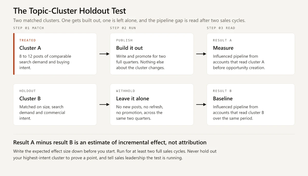
In ascending order of difficulty:
- Topic-cluster holdout. Pick two clusters of comparable size, search demand and commercial intent. Build one out over two quarters and leave the other where it is. Compare influenced pipeline from accounts that read cluster A against cluster B. Cheapest to run, weakest control, still better than the alternative.
- Geographic holdout. Publish and promote a campaign in some regions and not others, then compare pipeline per region against the pre-period baseline. This is the standard incrementality design in paid media and it carries over to content distribution, though not to organic search, which pays no attention to your geo split.
- Time-series counterfactual. Model what the metric would have done without the intervention, then compare reality against the model. Google’s open-source CausalImpact package, based on Brodersen and colleagues in the Annals of Applied Statistics (2015), builds a Bayesian structural time-series prediction of the counterfactual from control series. Its documentation states the condition plainly: the control series must be ones “that were themselves not affected by the intervention”.
Rules I would hold to on any of the three:
- Run for at least two full sales cycles, or the lagging layer has no data in it yet.
- Choose a holdout you can afford to lose. Never hold out your highest-intent cluster to prove a point.
- Write the expected effect size down before you start. A test with no pre-registered prediction turns into a search for a flattering cut of the data.
- Accept a directional result. You are deciding whether to fund a program, not submitting to a journal.
- Stop calling the output attribution. It is an estimate of incremental effect, and that difference is the entire reason the test was worth running.
What a holdout gives you is one sentence a CFO can hold onto: accounts exposed to cluster A produced X% more influenced pipeline than the matched holdout over two quarters. That sentence beats a multi-touch attribution dashboard in every board meeting I can picture, because it survives the follow-up question.
Which Content Metrics Should You Delete?
Delete any metric that cannot change a decision. On a typical SaaS content dashboard that means average time on page, bounce rate, social shares, total keyword count, pages per session, and total organic sessions as a headline number.
Each one fails the same way:
- Average time on page rises when a page is confusing and falls when a page answers the question fast, so it cannot be read in either direction without a second metric to interpret it.
- Bounce rate on a blog punishes the article that fully answered the query.
- Social shares track how emotive a topic is rather than how close the reader is to buying.
- Total organic sessions rewards publishing anything that ranks, which is how a B2B blog ends up ranking for job-seeker queries and calling it growth.
Keep total sessions as a diagnostic one level down. A 40% drop tells you something broke. A 6% rise tells you nothing worth a slide.
The replacement rule is one line: for every metric you delete, name the decision the surviving metric will inform. If no decision surfaces, that whole row was decoration.
Deleting without replacing leaves a hole that a worse metric fills within a quarter, so map them one to one before the dashboard rebuild:
| Deleted | Report instead | Decision it informs |
|---|---|---|
| Average time on page | Scroll depth to the conversion module on money pages | Whether the page structure buries the offer |
| Bounce rate on the blog | Next-page rate into product or pricing URLs | Which posts deserve an internal link into the product |
| Social shares and likes | Self-reported mentions of the channel on the demo form | Whether that channel belongs in the distribution plan |
| Total keyword count | Positions held on the defined query set | Which clusters to build or refresh next quarter |
| Pages per session | Distinct readers per target account in 30 days | Which accounts sales should call this week |
| MQLs from gated content | Content-touched accounts reaching an engagement threshold | Whether gating is costing more reach than it buys |
The last row is the one that draws an argument, so bring the comparison rather than the opinion: run the same asset gated for one quarter and ungated the next, and compare influenced accounts instead of form fills.
The Reporting Line You Can Defend in a Board Review
Everything above collapses into one paragraph you can say out loud, take a hostile follow-up question on, and keep your footing. It works because it declares its own uncertainty before anyone else gets the chance.
Over the last two quarters, accounts that touched content before opportunity creation produced [X] in closed-won revenue against [Y] in fully loaded content cost. Content-touched opportunities closed at [A]% versus [B]% for untouched opportunities. Those figures use an any-touch-before-opportunity rule; under a stricter last-touch rule the same period reports [Z], and the gap between the two is a modeling choice rather than a fact. Separately, [N]% of demo requesters named a content asset when asked how they first heard about us, against [M]% our tracking attributed to content.
What is doing the work in that paragraph:
- It leads with revenue and cost, in that order, because that is the comparison the room is running anyway.
- It gives a comparison instead of a total, so the “they would have bought anyway” question is answered before it is asked.
- It states the attribution rule, then reports the same period under a second rule. Naming your own model’s sensitivity removes the strongest available attack.
- It closes with the self-reported gap, which is the honest presentation of layer 4 and the reason to keep funding demand creation.
What the paragraph never does is present a single content ROI multiple as though it had been measured. A stated range with a named rule earns more credibility across four quarters than a confident number somebody eventually pulls apart.
Anchor all of it to a documented plan. A reporting line lands differently when the board has already seen the content marketing framework that produced the content, because then the numbers read as evidence about a strategy rather than a defense of a cost center.
How to Measure SaaS Content Marketing in 90 Days
Standing up all four layers at once fails. Sequence it.
| Window | What you do | What you have at the end |
|---|---|---|
| Days 1 to 15 | Add the self-reported attribution field to every demo and trial form, as an open text box rather than a picklist, and pipe it into a CRM field. Define the query set: 40 to 120 buying queries, written down, with named competitors. Agree the influenced-account rule with sales ops in writing. | The three inputs everything else reads from |
| Days 16 to 45 | Build one dashboard carrying organic share on the defined query set, distinct readers per target account, sales asset usage, and self-reported mix. Review it monthly rather than weekly. | A layer-2 view, reviewed on a cadence that matches how fast it moves |
| Days 46 to 60 | Run the influenced-pipeline and win-rate-delta query against the last four quarters of closed opportunities. | A layer-3 baseline on day 60 instead of day 300, out of records you already have |
| Days 61 to 90 | Pick the holdout clusters, write down the expected effect, set the read date two sales cycles out, and tell sales leadership the test is running. | One experiment in flight that nobody will accidentally contaminate |
Weekly review of a quarterly-moving metric produces noise-chasing, which is the main reason the layer-2 dashboard gets a monthly cadence and the layer-3 query gets a quarterly one.
By day 90 you have three layers reporting and one experiment running. That is a defensible measurement program, and none of it required a new platform.
Mistakes That Break Content Measurement
Broken content dashboards mostly break for process reasons rather than data reasons.
- Changing the attribution rule mid-year. Every trend line before the change becomes uninterpretable, and the change usually happens because somebody disliked a number.
- Presenting a layer-2 number as though it were revenue. Organic share moving from 14% to 19% is real progress and it is not pipeline. Say which one you are showing.
- Judging a program inside one sales cycle. With buying cycles around ten months, a content bet reviewed at month four is being reviewed before its evidence exists.
- Treating self-reported attribution as precise. People misremember, and the field collects noise alongside signal. Bucket it, read it directionally, and never add it to tracked numbers to make a bigger total.
- Counting the same closed-won deal in the content deck, the paid deck and the events deck. Influence overlaps by definition, so agree once that influenced numbers are not additive and print that line under every table.
- Reporting averages where the distribution is what matters. One $2M deal can carry a quarter. Show the median deal size alongside the mean, or a single outlier will set your budget for next year.
Limits of the Four-Layer Model
The model gives a worse answer than it appears to in these situations.
| Situation | Why the model misreads it | Report this instead |
|---|---|---|
| Fewer than roughly 50 closed opportunities per period | The win rate delta swings on single deals | The raw counts next to the percentage, or neither |
| A pure self-serve product with no account concept | Layer 3 assumes opportunities exist | Activated accounts and expansion revenue, and expect noise, because signup-to-paid conversion is measured in days rather than quarters |
| The first 12 months of a content program | Layer 3 has no data yet and layer 2 movement is small in absolute terms | Layer 2 as trajectory against the query set, with layer 3 named as a year-two output |
The third row is the one that costs teams their budget. A program judged on lagging metrics before its first sales cycle completes gets cancelled on schedule.
One more limit is worth naming out loud: the model measures effect and says nothing about whether the work was any good. A cluster can post a healthy win rate delta because it ranks for high-intent queries while reading like a competitor’s brochure. Keep a human review of the writing next to the numbers, or you will optimize your way into a blog nobody would quote.
Start With the Form Field
The objection at the top of this page was half right. No tool will hand you a true, exact revenue number for a blog post published nine months before a deal closed. A four-layer report, a stated attribution rule, a quantified gap between tracked and self-reported source, and one holdout test will tell you enough to fund the right work.
Learning how to measure SaaS content marketing is mostly a willingness to publish the uncertainty next to the number. Start this week with the cheapest piece of it: add the how-did-you-hear-about-us field.
Frequently Asked Questions
How do you measure SaaS content marketing?
Split the measurement into four layers: production output, leading indicators that move inside a quarter, lagging revenue indicators tied to closed deals, and the effects your stack cannot attribute at all. Report all four, label the fourth as an estimate, and use a holdout test rather than last-touch attribution when you need to know whether a content bet actually caused the revenue.
What are the most important B2B content marketing metrics?
Organic share of the queries your buyers search, assisted pipeline where a content page appears anywhere in the account journey, self-reported attribution captured on the demo form, and sales usage of content in live deals. Sessions and time on page belong in the production layer, where the content team reads them and nobody else does.
Can you calculate content marketing ROI in B2B SaaS?
You can calculate a defensible range, not a single true number. The honest version divides content-influenced closed-won revenue by fully loaded content cost, states the attribution rule used, and reports the same figure under a second rule so the reader can see how much of the answer is a modeling choice.
Why does last-touch attribution undercount content marketing?
Last touch credits the final click before a conversion, so the blog post that created that branded search months earlier gets nothing. HockeyStack's 2024 self-reported attribution report compared what buyers said against the last touch its software recorded and concluded that for the majority of prospects, the two did not overlap.
How long before you can judge a SaaS content program?
Give leading indicators one quarter and lagging revenue indicators two to three sales cycles. With B2B buying cycles averaging about ten months in 6sense's 2025 research, a content program killed at month four was judged before its lagging layer could produce a single data point.