What Is a Good Average Position in Google Search Console?
A good average position in Google Search Console is judged per query, not site-wide: my average got 7 places worse from May to August 2026 while clicks tripled.
Of the four months from May to August 2026, this site’s best average position in Google Search Console came in the month with the fewest clicks: 16.7 in May, on 19 clicks in 31 days. August came in at a worse 23.4 and brought 59 clicks. That is the problem with asking what is a good average position in Google Search Console: on this site the better number came with a third of the clicks.
There is no good site-wide average position: the figure is weighted by impressions, so it worsens whenever new impressions land deeper than the current figure, even while clicks grow. Judge position per query or per page, next to the clicks each one earns, and read the site-wide figure as a description of where your impressions sit.
All of this site’s Search Console numbers below come from its export, pulled on 3 September 2026, search type Web. The monthly evidence starts in May 2026 because Google’s Data anomalies page records that “A logging error prevented Search Console from accurately reporting impressions from May 13, 2025 until April 27, 2026”, with CTR and average position affected too and clicks unaffected. What the fix looked like in this site’s daily data is in my breakdown of a Search Console impressions drop.
What Is a Good Average Position in Google Search Console?
For one query, a good average position is 1 to 3, because that is where organic clicks concentrate; for a whole site, no single figure counts as good or bad. First Page Sage’s CTR meta-analysis, updated September 22, 2026, reports that “The top 3 organic results now capture 77.1% of all remaining organic clicks, up from 68.7% in 2025.”
Which number you are judging depends on where in the report it comes from:
| What you are judging | Where it appears | Good or bad on its own? | Read it next to |
|---|---|---|---|
| The whole site: the site-wide figure | The chart and its Average position tile | No: it blends every query, page, country and device | Impressions and clicks for the same dates |
| One query | The Queries tab | Yes, over a short date range: 1 to 3 with clicks is good | That row’s clicks |
| One page | The Pages tab | Partly: it averages every query the page appeared for | The page’s own queries (filter by the page, then open Queries) |
| One country or device | The Countries and Devices tabs | No: each row still blends queries | The same row’s clicks |
For a single query or page, read the position like this:
- 1 to 3 with clicks: the position is doing its job, so protect the page.
- 1 to 3 with no clicks: search the query and check whether an AI Overview holds that slot.
- 4 to 10: page one, yet on this site that band barely paid, which I measured in the striking distance band table. Look at the title, the snippet and whatever sits above the result.
- 11 to 20: striking distance. Work it only if the band above it pays on your site.
- 21 and deeper: exposure rather than traffic. The decision is whether the query is worth targeting at all.
- Any row under about 100 impressions: too thin to judge. That is the floor I used when testing word count against average position.
How Is Average Position Calculated?
Search Console takes the topmost position your site held each time it earned an impression, then averages across impressions. My guide to checking your SEO ranking quotes Google’s short definition, which averages “across all queries”; further down the same explainer on impressions, position and clicks, Google is more precise: the metric “averages the position value for all impressions (because the position of the link will be different each time it is seen)”. The same page sets the rules for what enters that average:
- Only your topmost result counts: “Query 1 returns your property at positions 2, 4, and 6: its position is counted as 2 (the topmost position).”
- A block shares one position: “An AI Overview occupies a single position in search results, and all links in the AI Overview are assigned that same position.” Carousels work the same way when their items can hold a search position.
Google’s own example then averages two queries, (2 + 3)/2 = 2.5, and treats each query as a single search, so both weigh the same. Real queries arrive with very different impression counts, and the bulk data export reference gives the formula that settles the weighting:
average position = SUM(sum_top_position)/SUM(impressions) + 1The sum_top_position field adds up the site’s topmost position “for each impression in that table row, where zero is the top position in the results”. Every impression adds its position once, so a query with 800 impressions pulls on the average 16 times harder than a query with 50.
A small made-up site shows the effect. No query changes position between the two months:
| Query | Position | Impressions, month 1 | Impressions, month 2 |
|---|---|---|---|
| A | 2 | 50 | 50 |
| B | 6 | 150 | 150 |
| C | 34 | 800 | 800 |
| D, new in month 2 | 48 | none | 1,000 |
| E, new in month 2 | 3 | none | 60 |
| Plain mean of the positions | 14.0 | 18.6 | |
| Weighted by impressions, as Search Console reports it | 28.2 | 37.1 |
Month 1 has two of its three queries on page one and still reports 28.2. In month 2 a new query joins the top three and no query loses a place, yet the reported average is almost nine places worse, because query D brought 1,000 impressions at position 48.
Google Search Console Average Position, May to August 2026
These are this site’s four months after the logging fix. Each month’s figure weights every day’s average position by that day’s impressions, which is the same arithmetic as Google’s formula.
| Month (2026) | Impressions | Clicks | Average position |
|---|---|---|---|
| May | 17,561 | 19 | 16.7 |
| June | 14,190 | 34 | 22.8 |
| July | 46,348 | 34 | 24.8 |
| August | 50,214 | 59 | 23.4 |
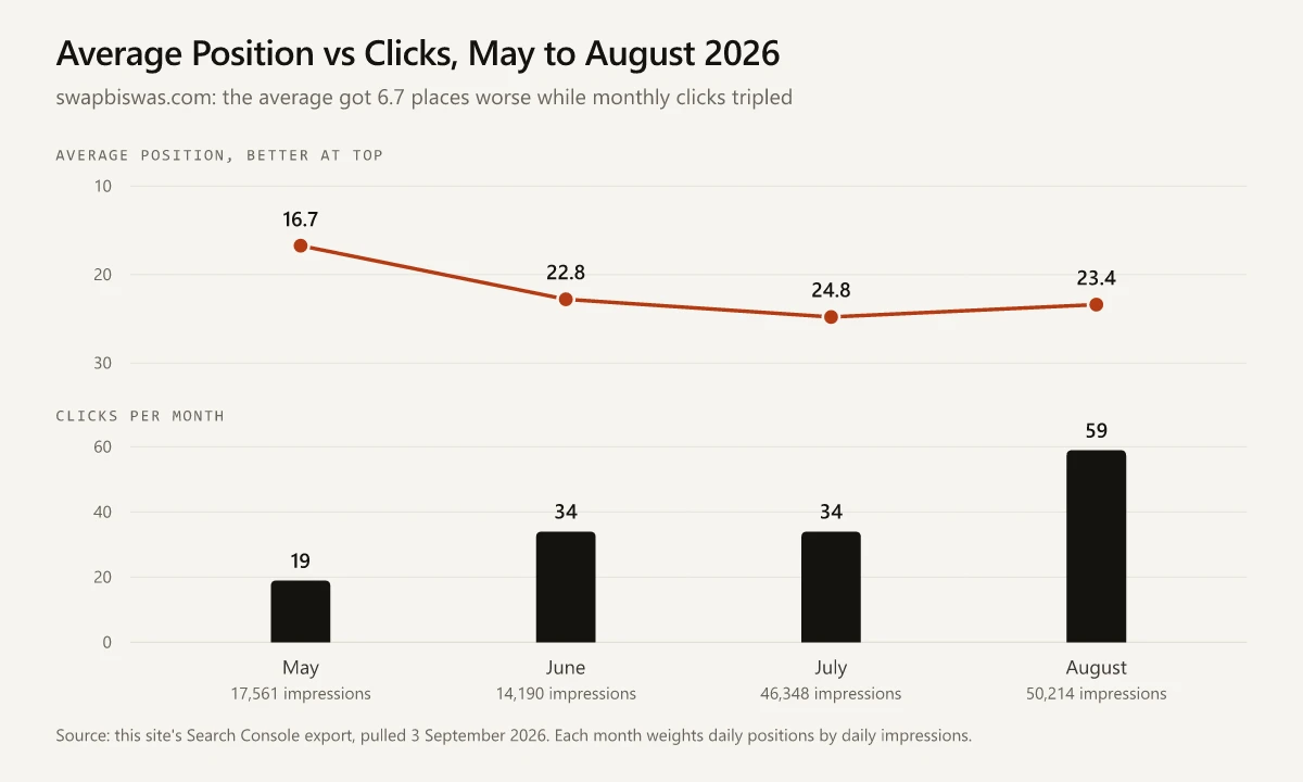
- From May to August the average got 6.7 places worse, while impressions grew 2.9 times and clicks went from 19 to 59.
- Most of that slide, 6.1 of the 6.7 places, came between May and June, while impressions fell. Inside May, 1 to 18 May averaged 15.0 on 734 impressions a day and 19 to 31 May averaged 22.0 on 334, which points to impressions at better positions fading rather than new ones arriving deeper. June then had fewer impressions than May, a worse average, and 34 clicks against 19.
- From June the pattern flips: by August impressions had grown 3.5 times and clicks had gone from 34 to 59, while the average slipped only another 0.6 places. That stretch is expansion, with new impressions arriving deeper than the old average.
- Day by day, the site-wide figure said almost nothing about traffic. Across the 123 days from 1 May to 31 August, the correlation between daily average position and daily clicks was 0.06, against 0.34 between daily impressions and daily average position (busier days came with a worse, higher position number).
- Split the same 123 days into thirds by impressions: the quietest 41 days averaged 20.6 and produced 38 clicks, and the busiest 41 averaged 23.5 and produced 72.
The blog’s publishing record lines up with the June and July part of the slide. Forty-nine posts carry a June or July 2026 date, and across those two months average daily impressions, week by week, rose from about 300 in early June to roughly 1,200 to 2,000 through July, while the weekly average position moved from about 20 to about 25. The query export covers all 16 months at once, so I cannot tie specific impressions to specific posts, and I read the timing as context rather than proof.
Search Console’s own figure for a month can differ from mine in the first decimal, because the export rounds each day’s position to one decimal place. To check your own months, set the date range to one calendar month and note the Average position tile.
Where This Site’s Average Position Comes From
The query export shows what a site-wide figure is made of. It holds the top 1,000 query rows for the full 16 months, so unlike the monthly table it includes the logging-error window, although about 81% of the 16 months’ impressions in the chart export were logged after the fix. Weighted by impressions, the 1,000 rows average 33.4, and each band of rows adds its share to that total:
| Query rows averaging | Share of impressions | Band average | Places added to 33.4 |
|---|---|---|---|
| 1 to 3 | 0.5% | 2.5 | 0.01 |
| 4 to 10 | 8.3% | 7.4 | 0.61 |
| 11 to 20 | 26.5% | 15.3 | 4.06 |
| 21 to 50 | 36.2% | 32.2 | 11.65 |
| 51 or worse | 28.6% | 59.5 | 17.03 |
Bands follow the cut rule in the striking distance table linked above, so a row at 20.3 counts in 21 to 50. Rows averaging worse than 20 add 28.7 of the 33.4 places, and between them they earned 3 of the export’s 49 clicks.
Deleting rows moves the figure by up to about 20 places, and the size of the move follows impressions, not clicks:
- Remove the 215 rows averaging worse than 50, which earned 1 click between them, and the average improves from 33.4 to 22.9.
- Cut every row worse than 20 and it drops to 13.3.
- Take out only the five queries with the most impressions, which earned no clicks between them (four phrasings of “seo report” and one about Google reviews), and it moves to 28.3.
- Remove only my own name, the query behind most of the export’s clicks, and the average moves by less than a tenth of a place.
The rows that earned clicks show the other half of the problem. Of the 13 clicks on queries other than my name and one misspelling of it, 9 came from rows averaging worse than 10. Seven of those sat on rows with more than 200 impressions, well above the 100-impression floor. One was a click on “free ai tools for marketing”, a row averaging 50.6 over 16 months, and that average does not show where the result sat on the day of the click.
Is an Average Position of 25 Good?
A site-wide 25 is neither good nor bad on its own: it is the impression-weighted mean of every query you appeared for, and it can hide a branded query near the top and hundreds of rows past 50. Across all devices my site averages 26.2 for the 16 months of the export (25.4 on desktop), and the band-by-band results from sixteen months without link building show that nearly all of its top-three clicks came from my own name.
To judge your own 25, work through the Queries tab in this order:
- Sort by impressions and look at the positions of the largest rows. If they sit past 20 with no clicks, they are what holds the site-wide figure near 25.
- Set your brand aside with the branded and non-branded queries filter, or a “queries not containing” filter on your brand name. Google’s page on dimensions and data groupings says the branded filter “isn’t available for sites with a low number of impressions”, and that anonymized queries are included in chart totals “unless a query filter is applied”, so compare table rows while any query filter is on.
- Sort by clicks and check where the rows with clicks sit. If they sit in the top three, the 25 is coming from the deep rows. If they sit worse than 10, as the rows behind 9 of this site’s 13 non-brand clicks do, filter to one of those queries, set the chart to Daily with Clicks and Average position turned on, and note the position on the days it earned clicks.
- Put this month’s figure next to last month’s, with impressions and clicks beside both. The direction of all three decides what the change means.
Average Position vs Ranking: Five Averages From One Site
A ranking is the position of one result for one search, and it changes with location, device and time. Average position blends every impression in the date range, and Google’s position explainer addresses the mismatch directly: “For your specific search your position might be different than the average because of many variables, such as your search history, location, and so on.” For today’s position on a specific query, use an incognito check or a rank tracker, both covered in my ranking-check guide.
Inside Search Console, “average position” is several numbers at once. This site, same 16 months:
| View | Aggregated by | Average position | Why it differs from the site-wide figure |
|---|---|---|---|
| Site-wide figure (chart) | Property | 26.2 | The reference: every impression, anonymized queries included |
| Queries table, 1,000 rows | Property, per query | 33.4 | Anonymized queries and rows beyond the export are missing |
| Pages table, 157 rows | Page | 26.1 | Two of your URLs on one results page count as two impressions |
| Desktop | Property | 25.4 | Mobile and tablet impressions left out |
| Mobile | Property | 29.3 | Desktop and tablet impressions left out |
The desktop and mobile rows are Search Console’s own figures; the other three are impression-weighted from the exported rows, and the site-wide figure matches the three device rows combined. Google’s documentation accounts for the gaps:
- Aggregation follows the dimension. Google’s Performance report help says: “Data grouped by Queries, Countries, Devices, or Dates is aggregated by property. Data grouped by Pages or Search appearance is aggregated by page.” A country row therefore blends every device, which I cover in my international SEO analysis of the same export.
- Google’s dimensions page gives two reasons the query table falls short of the site-wide figure: anonymized queries count in chart totals but never appear as rows, and Search Console “stores and shows only the most important data rows”, so the table also misses rows that were never anonymized.
All five cover the same 16 months, including the logging-error window, so compare them with each other and not with the monthly table.
How to Read a Change in Your Average Position
The site-wide figure is useful in a report only when you read its direction next to clicks for the same dates.
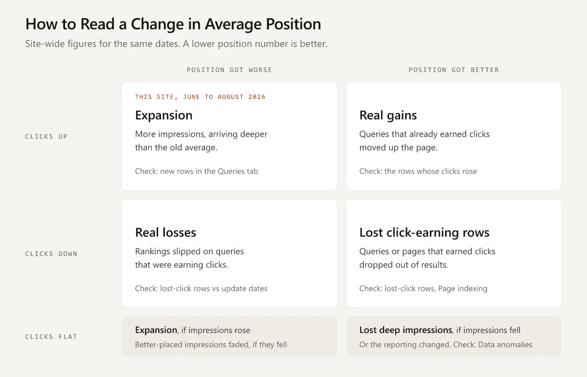
The table adds impressions to each row, which splits the grid’s expansion cell in two:
| Average position | Clicks | Impressions | Likely cause | Check first |
|---|---|---|---|---|
| Worse | Up or flat | Up | New impressions arriving deeper than the old average. This site’s June to August 2026 sits here | New rows in the Queries tab, sorted by impressions |
| Worse | Up or flat | Down | Impressions at better positions faded. This site’s May to June 2026 sits here | The earlier period’s largest rows, and where they sit now |
| Worse | Down | Any | Rankings slipped on queries that paid | The rows that lost clicks, against known update windows |
| Better | Up | Any | Queries that already paid moved up | The rows whose clicks rose |
| Better | Down | Any | Click-earning queries that sat deeper than the average dropped out, or their pages left the index | The rows that lost clicks, then the Page indexing report |
| Better | Flat | Down | Deep impressions disappeared, or the reporting changed | Total impressions, then Google’s Data anomalies page |
June to July 2026 shows the flat-clicks case on this site: the figure went from 22.8 to 24.8 while clicks held at 34 and impressions were 3.3 times June’s, which is expansion.
What Is a Good Average Position in Google Search Console for Your Site?
A good average position in Google Search Console is a short list rather than one number: the positions of the queries that earn clicks, checked one row at a time. On swapbiswas.com the site-wide figure got worse in the same months that clicks tripled, and I would not grade any site on it. Export the Queries tab sorted by clicks, keep the rows that earned at least one, and save the file with the month in its name. Next month, compare those rows before you look at the site-wide figure.
Frequently Asked Questions
Is an average position of 25 good in Google Search Console?
A site-wide 25 is neither good nor bad on its own. It can combine a few top-three queries that earn most of the clicks with hundreds of deep queries that earn none, so sort the Queries tab by clicks and judge the positions of the rows that earn them.
How is average position calculated in Google Search Console?
Search Console records the topmost position your site held for each impression and averages across all impressions, so a query with more impressions carries more weight. Google's bulk export reference gives the formula as SUM(sum_top_position)/SUM(impressions) + 1, with positions counted from zero.
What does average position mean in Google Search Console?
It is the topmost position your site held in Google results, averaged across every impression in the date range, so it is not where you rank today. Impressions on new, deeper queries push the number up, which is worse, even while clicks grow.
Why is my average position in Google Search Console getting worse?
Either the mix of impressions moved deeper, from new queries ranking below your current average or from better-placed queries losing impressions, or rankings slipped. On this site the average went from 22.8 in June 2026 to 23.4 in August while impressions grew 3.5 times and clicks rose from 34 to 59. If clicks fell too, check the queries that lost clicks first.
How do I improve my average position in Google Search Console?
Pick single queries with real impressions and work them toward the top three, where clicks concentrate: start with rows at 4 to 10 and compare your result's title and snippet with what ranks above it; work 11 to 20 only if the 4 to 10 band earns clicks for you. Removing pages that collect deep impressions also improves the site-wide figure without adding a click, so do not make that figure the target.