LinkedIn Banner Safe Zone: 9 Guides and a Free Overlay PNG
LinkedIn's Help page gives no LinkedIn banner safe zone, so I checked what 9 guides print. The post has the math to rerun and a free 1584 x 396 overlay PNG.
LinkedIn’s Help page for the profile cover image specifies a JPG or PNG file under 8 MB at 1584 x 396 pixels and gives no safe zone, so every LinkedIn banner safe zone figure you will find online comes from a third party.
The page is “Add or change the cover image on your profile”, and it carried a “Last updated: 7 months ago” stamp on 10 October 2026. It says the image “appears behind your profile photo in the introduction section on your profile” and that “How your image appears may change based on the size of your web browser window and screen resolution.” The page names no aspect ratio, no margin and no phone crop, and its Mobile Browser steps call the same image a background photo.
Obey every safe-zone number in nine banner guides at once and you are left with a 46 x 168 pixel box, 1.2% of the banner. Five of the guides print a safe box, a sixth prints only the photo zone, and none says how its numbers were measured. My view is that a safe zone belongs to your screens rather than to a guide, so the useful thing to hand over is the conversion, with my own working values shown as one example of it. The free overlay, a transparent 1584 x 396 PNG that marks both photos and the phone window, is in the download section.
What Is the LinkedIn Banner Safe Zone?
The LinkedIn banner safe zone is the part of your 1584 x 396 cover image that stays visible on desktop and phone, clear of your profile photo. LinkedIn does not publish one. Third-party guides print estimates, so measure your own screens: on a desktop showing the whole banner, scale = 1584 / its displayed width.
The cover image is a different object from the link-preview card a shared URL shows, whose sizes are in my OG image size guide.
LinkedIn Banner Safe Zone Figures in 9 Guides
I fetched each guide on 10 October 2026. Figures are in upload pixels on the 1584 x 396 canvas, with x counted from the left edge and y from the top, and the date is the one each page shows.
| Guide | Date on the page | Safe-zone figure it prints | Where it puts the profile photo | LinkedIn Help page it links |
|---|---|---|---|---|
| Magic Studio | 14 Jul 2026, modified 7 Oct 2026 in its structured data | No numbers: “Keep the lower-left clear” and put the message in the center or center-right; its diagram has no coordinates | Lower left | The cover image page |
| RightBlogger | Updated 22 Aug 2026 | The middle two-thirds of the width and the upper two-thirds of the height, with nothing within about 10% of an edge; for phones, “preview at 50% width to simulate the mobile crop” | Bottom-left on desktop; on mobile it “shifts toward the center and sits lower” | Three pages, the cover image page among them |
| Capsule | 9 Jan 2026 | About 1546 x 423, taller than the 396 px canvas; on phones 1350-1456 x 220-360 | A restricted bottom-left 568 x 264 on desktop and mobile | None |
| Zeliq | 24 Jul 2026 | 1,350 x 220 centred, with 75 px side margins, which add up to 1,500 px rather than 1,584 | On phones “in the center”: a 152 x 152 zone, plus a central 700 x 300 zone to avoid | None; a “Source:” line names “official LinkedIn documentation” in plain text |
| LinkedGrow | 19 Jun 2026 | About 1200 x 300 (190 px at the sides, 48 px top and bottom); phones crop “roughly 15% from each side”, or 238 px | Bottom-left: 170 x 170 on desktop, 220 x 220 on mobile | None |
| ScreenSnap | Updated 4 Sep 2026 | A central 1100 x 280 box “shifted slightly to the right”, and “Right two-thirds” in its comparison table; phones trim about 60 px from each side | Bottom-left 220 x 220 on desktop; bottom-center on phones | The Help Center home page |
| Taplio | 17 Sep 2026, in its structured data | No box: keep the message “in the upper left or the centre” | Lower left: 250 px in from the left edge, over the bottom two thirds of the height | None, and it says LinkedIn publishes no personal banner figure, though the cover image page lists 1584 x 396 as recommended |
| Postbeam | Updated 29 Jun 2026 | No numbers; a free Canva template with the danger zone in teal dotted lines | Bottom-left | None |
| PostFast | Updated 16 Sep 2026 | No numbers: keep the message “right in the center”; its infographic shows sizes only | Bottom-left | None |
| Every number above at once | Derived | x 1142-1188, y 88-256: 46 x 168, 1.2% of the canvas | Clear of every no-go zone above | The working is below |
None of the nine says how its numbers were measured, on which device or in which app version. The nearest thing to a method is RightBlogger’s line, “don’t trust any guide that gives you a precise pixel number”, followed by its advice to upload the banner and check the profile on a phone.
The Box That Satisfies Every Published Number
For the derived row, every box and no-go zone the guides print goes on one 1584 x 396 canvas, with any box whose page gives no position centred:
- RightBlogger’s middle two-thirds runs x 264-1320 (1584 / 6 = 264), its upper two-thirds ends at y 264, and its 10% edge rule starts it at y 40. Its 50% width preview for phones, centred, keeps x 396-1188.
- Capsule’s smallest phone area and Zeliq’s box, both 1350 x 220 and centred, run x 117-1467 and y 88-308. Capsule’s FAQ also keeps text “away from the bottom 140 pixels”, which stops it at y 256.
- LinkedGrow’s margins give x 190-1394 and y 48-348, and its 15% phone crop gives x 238-1346. ScreenSnap’s 1100 x 280, centred because the page gives no size for its shift, is x 242-1342 and y 58-338, and its comparison table puts the personal banner’s safe zone in the “Right two-thirds”, which starts at x 528.
- The overlap of those boxes is x 528-1188, y 88-256, which is 660 x 168 pixels. Looser rules, such as LinkedGrow’s 200 px and ScreenSnap’s 80 px side margins, do not cut into it.
- Two no-go zones reach into it: Capsule’s bottom-left 568 x 264 (x 0-568, y 132-396) and Zeliq’s central 700 x 300 (x 442-1142, y 48-348). Zeliq’s alone removes everything from x 528 to x 1142.
- Every other no-go zone stops short of x 1142, so it removes nothing new. That covers the bottom-left photo zones of LinkedGrow (170 x 170 on desktop, 220 x 220 on mobile), ScreenSnap (220 x 220 on desktop) and Taplio (250 px wide), as well as LinkedGrow’s “bottom-left quarter”, ScreenSnap’s “bottom-left third” and Zeliq’s 152 x 152 phone photo. ScreenSnap moves its phone photo to “bottom-center” without a size, and it would need to be 700 px wide to reach x 1142.
- What survives is x 1142-1188, y 88-256, a 46 x 168 box covering 1.2% of the canvas and 2.9% of its width.
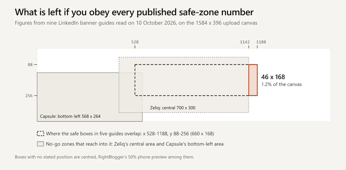
That box sits inside the phone window my render script draws and clear of both photo circles in it, so it passes every published number and the script’s geometry together. It is also 46 px wide and right of centre, where Taplio and PostFast would not put a message, so read it as the strictest numeric answer rather than a recommended spot.
Convert What Your Screen Shows Into Upload Pixels
Whatever size a screen shows the banner at, a measurement on that screen converts to upload pixels with one ratio:
scale    = width of the upload that is visible / width the banner is shown at
upload x = left edge of the visible part + screen x * scale
upload y = top edge of the visible part + screen y * scale
If your desktop screenshot shows the whole banner, as my script assumes, scale = 1584 / the displayed width; if it shows less, the overlay’s rulers give the visible part, as in the self-check below. Take every measurement from one screenshot and the screen’s pixel density cancels out, since the banner width and the photo carry the same density.
My working values come from the script that renders my own LinkedIn banner from HTML at 2x, the route in my Claude Design vs Claude Code comparison, and the same script draws a safe-zone overlay from them. The script’s comments do not say how the values were taken (its README dates the banner set to 25 September 2026), and its phone line ends with the word “Approximate”, so read them as working assumptions:
| Working value | Desktop | Phone app |
|---|---|---|
| Banner shown at | 804 x 201 px | 390 x 130 px |
| Part of the upload shown | All of it: x 0-1584, y 0-396 | x 228-1356, y 10-386 |
| Photo on screen | A 160 px circle, 24 px from the left, 89 px from the top | A 96 px circle, 16 px from the left, 66 px from the top |
| Scale | 1584 / 804 = 1.970 | 1128 / 390 = 2.892 |
Worked through for both photos:
- Desktop: the photo’s centre on screen is (24 + 80, 89 + 80) = (104, 169). Multiplied by 1.970, that is (204.9, 332.9) in upload pixels, and the radius is 80 * 1.970 = 157.6. The circle runs from x 47.3 to x 362.5 and starts at y 175.3.
- Phone: the centre on screen is (16 + 48, 66 + 48) = (64, 114). In upload pixels that is (228 + 64 * 2.892, 10 + 114 * 2.892) = (413.1, 339.7), and the radius is 48 * 2.892 = 138.8. The circle runs from x 274.3 to x 551.9 and starts at y 200.9; the window ends at y 386.
Mapped onto the upload and rounded outward to whole pixels, the zones are:
| Zone | x range | y range | What it means |
|---|---|---|---|
| Desktop photo | 47-363 | 175-396 | A 315 px circle over 56% of the banner’s height in that column |
| Phone photo | 274-552 | 200-386 | A 278 px circle; approximate |
| Phone window | 228-1356 | 10-386 | 71.2% of the width, with 228 px (14.4%) cut from each side; approximate |
| Clear of both photos | 552-1356, or 228-1356 | 10-386, or 10-175 | An 804 x 376 block, plus a 1128 x 165 band above the photos |
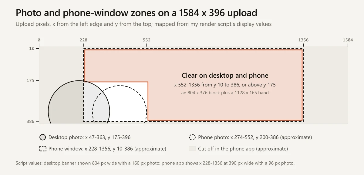
On my own banner, the main line starts at about x 265 and y 80, inside that band above the photos, and the text under it starts at x 600, 48 px clear of where the phone photo ends. Why that line counts as a tagline rather than a slogan is in my tagline vs slogan vs motto breakdown.
LinkedIn Banner Mobile vs Desktop: What the Phone Hides
One file serves both views, and LinkedIn’s page lists a single recommended size with no mobile variant. With my script’s values, the two views differ like this:
| Desktop | Phone app (approximate) | |
|---|---|---|
| Share of the upload shown | All of it, a 4:1 frame | 67.6% of the area, a 3:1 frame |
| Photo’s left edge | x 47 | x 274 |
| Photo’s top edge | y 175 | y 200 |
| Photo diameter in upload pixels | 315 | 278 |
| Part of the photo that overlaps the banner | 112 of its 160 px, 70% | 64 of its 96 px, 67% |
In my script, the phone hides the left 228 px, where most of the desktop photo sits, and draws its own photo further right. A line of text at x 370 and y 300 clears the desktop photo and sits under the phone photo, which is why the clear block starts at x 552 rather than x 363. LinkedIn’s caveat about browser window size also means 804 px is one desktop width among many.
On the phone, the guides disagree on:
- How much is cut: about 60 px a side at ScreenSnap, 238 px (roughly 15%) at LinkedGrow, and 396 px, a quarter of the width, at RightBlogger if its 50% preview is centred. My script’s 228 px sits next to LinkedGrow’s figure.
- The frame: ScreenSnap describes a crop on the sides only, and trimming 60 px from each side leaves 1464 x 396, a 3.7:1 frame narrower than the 4:1 upload, yet the same page says the visible area “gets closer to 5:1”.
- Where the photo goes: RightBlogger, ScreenSnap and Zeliq move it toward the middle, while LinkedGrow and Capsule keep it at the left and make it bigger. My script keeps it 16 px from the left edge of the phone screen.
- Where the message goes: PostFast says “right in the center” and Taplio “in the upper left or the centre”, while Zeliq keeps critical text out of “the central 700 x 300 px zone” because the phone photo covers it.
Download the Safe Zone Overlay (PNG Template)
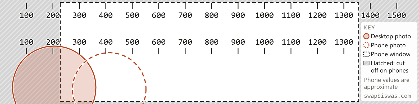
Download the overlay PNG: 1584 x 396 with a transparent background, drawn from the values above. It shows:
- a solid circle for the desktop photo and a dashed circle for the phone photo
- a dashed rectangle for the phone window, with the area outside it hatched
- two rulers numbered every 100 px, one along the top edge and one across the middle
- a key in the right-hand strip, outside the phone window
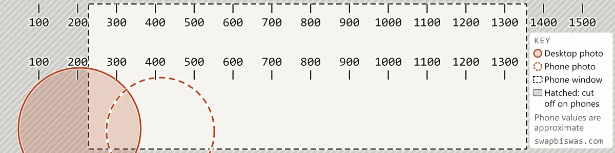
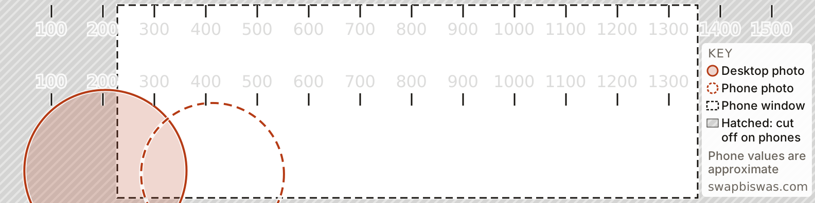
Put it on top of a 1584 x 396 canvas in your design tool, keep text in the clear area, and hide the layer before you export. The marks carry a white edge, so they show on a dark banner as well as a light one. To redraw the circles for your own measurements, edit the overlay’s SVG source.
None of the nine guides links an overlay file to drop over a design you already have.
Check Your Banner on Desktop and Phone After Upload
-
Export a test copy of your banner with the overlay layer still visible.
-
Upload it and leave LinkedIn’s crop and position controls alone. The cover image page lists “change the position and size” among the edits, and any drag or zoom moves your design against these coordinates.
-
Screenshot your profile on desktop at the window width you normally use, and in the LinkedIn app on your phone.
-
On the phone screenshot, note the lowest and highest numbers you can see on either ruler: that pair brackets your phone window. For exact inputs, call those two ticks A and B, measure each screen position in pixels from the top-left corner of the banner on the screenshot, and work out:
scale     = (B - A) / (screen x of B - screen x of A)
left edge = A - screen x of A * scale
top edge  = 182 - screen y where a middle-ruler tick starts * scale
Middle-ruler ticks start at y 182. The top ruler’s ticks start at y 10, the line where my script’s phone window starts, so a phone that crops a few pixels more would cut them and still read as 10. Then measure the photo on both screenshots and convert it with the formula above.
-
Upload the clean banner straight away, since anyone who opens your profile in the meantime sees the test copy and counts in your profile views, which my explainer on search appearances vs profile views separates from appearances in search. Then check both views again for text that is cut off or covered.
If the clean version looks soft, LinkedIn’s page says to “choose an image with a larger file size” and adds that “Photos will also look better than images with logos.”
LinkedIn Company Page Cover: Its Own Spec and Placement Advice
LinkedIn’s image specifications for Pages, which showed “Last updated: 2 months ago” on 10 October 2026, list the Page cover image at 1512 x 256 pixels as both the minimum and the recommended size. Every Page image must be PNG or JPEG with “a maximum size of 3MB”.
The Pages page also gives the placement advice the profile page leaves out: “You should place key details away from the edges of your cover photo, especially in the lower-right corner. Since images may get cropped on different screen sizes, placing important information in the center ensures that it is always visible.”
Six of the nine guides above print 1128 x 191 for a Page cover: Capsule, Zeliq, LinkedGrow, ScreenSnap, Postbeam and PostFast. That figure appears nowhere on LinkedIn’s Pages page, and Magic Studio, RightBlogger and Taplio print LinkedIn’s 1512 x 256.
Measure Your Own LinkedIn Banner Safe Zone
The published figures differ more than sixfold on the phone crop and more than threefold on the width of the photo zone. My script’s values describe one desktop window width and a phone layout the script itself calls approximate, so the LinkedIn banner safe zone worth designing to is the one you measure on your own profile.
Two screenshots and the conversion above are enough to measure it. Start with the phone screenshot.
Frequently Asked Questions
What is the safe zone for a LinkedIn banner?
LinkedIn does not publish one. Its cover image Help page gives a 1584 x 396 recommended size, JPG or PNG, under 8 MB, and no advice on where to put text. Guides print boxes as different as 1100 x 280, 1200 x 300 and 1350 x 220 pixels, so measure your own screens: on a desktop that shows the whole banner, scale = 1584 / its displayed width.
What size is a LinkedIn banner on mobile and desktop?
One file serves both: LinkedIn recommends 1584 x 396 pixels and lists no separate mobile size. My render script assumes desktop shows the full width, as Capsule, ScreenSnap and LinkedGrow say, and puts the phone app's view at about x 228-1356 of the upload, a 3:1 frame it marks as approximate.
Where does the profile photo cover a LinkedIn banner?
On desktop it covers the lower left: guides put that area anywhere from 170 x 170 (LinkedGrow) to 568 x 264 pixels (Capsule), and my render script's desktop values map the photo circle to about x 47-363, from y 175 down to the bottom edge. On phones, RightBlogger, ScreenSnap and Zeliq move the photo toward the middle, and Zeliq marks a central 700 x 300 zone to avoid.
Is there a LinkedIn banner safe zone template?
This post links a transparent 1584 x 396 PNG overlay that marks the desktop photo, the phone photo and the phone window, with two numbered rulers; put it on top of your design and hide it before you export. Postbeam links a free Canva template with its photo zone marked.
What size is a LinkedIn company page cover image?
LinkedIn's Page image specifications list 1512 x 256 pixels as both the minimum and the recommended size, in PNG or JPEG, with a 3 MB limit for Page images. Six of the nine banner guides I checked print 1128 x 191 instead, a figure that is not on LinkedIn's page.